Why Your Website Home Page Confuses Every Visitor
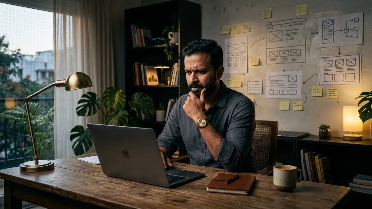
Most business owners I meet are proud of their website. They spent good money building it, the design looks clean, and it has all the right pages — Home, About, Services, Contact. But when I ask them how many enquiries they get from it every month, there is a long pause. Usually the answer is two or three. Sometimes zero. The website looks fine. The problem is it does not communicate clearly.
Here is what actually happens when a visitor lands on your home page. They spend about eight seconds deciding whether to stay or leave. In those eight seconds they are trying to answer one question — is this the right place for what I need? If your home page cannot answer that quickly, they leave. They do not scroll. They do not call. They just close the tab and move on to the next result.
The most common mistake I see on Indian business websites is leading with the company name and a tagline that means nothing. 'Excellence in Every Step.' 'Quality You Can Trust.' 'Your Success, Our Mission.' I have seen these exact phrases on websites for a chemical manufacturer, a CA firm, a garment exporter and a pest control company. These lines say nothing specific. A visitor reading that line still does not know what you do, who you serve, or why they should stay.
The second mistake is organising your home page around what you want to say rather than what your visitor needs to hear. Most founders want to show their history, their awards, their team size and their infrastructure. That is understandable — you are proud of what you have built. But a visitor who just found your website is not yet interested in any of that. They want to know if you can solve their specific problem. The home page needs to speak to their situation first, not your achievements.
I worked with a Pune-based industrial packaging manufacturer whose website had a beautiful full-screen image of their factory, followed by a paragraph about how they were established in 1998 and had 200 employees. Underneath that was a grid of product categories with technical names that only insiders would understand. They were getting visitors from Google but almost no enquiries. We restructured the home page to open with a clear line about what they make and who they supply to. Then we added a short paragraph about the problems their buyers typically face — damaged goods in transit, inconsistent quality, long lead times. Enquiries from the website doubled in six weeks without changing anything else.
The third problem is too many choices at the top of the page. Navigation menus with eight or ten items. Multiple banners rotating with different messages. Three different calls to action all competing with each other — 'Call Us', 'Download Brochure', 'Get a Quote', 'View Catalogue'. When everything is asking for attention, nothing gets it. Your home page needs one primary action you want the visitor to take. Make that action obvious, easy and low-friction. For most B2B businesses, that is either a phone call or a short enquiry form. If you want to think through what that primary action should be for your specific business, a one-to-one consultation can help you map that out cleanly.
There is also the problem of language that is too formal or too technical. Some websites read like a company brochure written for a trade expo. Long sentences, passive voice, industry jargon. Your website visitor is reading on a phone, often while commuting or between meetings. They are not going to work hard to understand you. Write the way you would explain your business to a smart person you just met at a social event. Short sentences. Plain words. Specific details. 'We supply corrugated packaging to FMCG brands in Maharashtra and Gujarat' is ten times more effective than 'We are a leading provider of sustainable packaging solutions for diverse industries.'
If you are not sure where your home page is going wrong, do a simple test. Send your website link to three people who do not know your business — a friend, a family member, a neighbour — and ask them to look at it for thirty seconds and then tell you what your business does and who it is for. If they cannot answer clearly, your home page needs work. This is a basic website audit you can do today at zero cost. If you want a more thorough review that covers your full site, messaging and local search presence, I run business growth workshops that include a website audit section specifically for MSME founders.
Fix your home page before you spend more on Google Ads, SEO or social media. It is pointless sending traffic to a page that confuses people. Start with the first line visible on your home page — make it say exactly what you do and who you do it for. Then make sure your most important call to action is visible without scrolling. Then simplify your navigation. These three changes alone can shift your conversion rate meaningfully. The goal is simple — every visitor who lands on your page should immediately feel they are in the right place.
Want to understand where your business growth is stuck?
Book a Business Growth Diagnostic with Abhijit JK — an honest, focused 60-minute one-to-one session with Abhijit JK on your brand, website and growth.
Book a Business Growth Diagnostic