Why Your Product Packaging Looks Cheap at Rs 999
Most business owners I meet have spent real money making their product. The formulation is right. The quality is solid. They have done months of testing. Then they put it inside a box or pouch designed in thirty minutes by someone who charges three thousand rupees for a complete packaging job. And then they wonder why the product does not sell at the price they expected.
Here is the uncomfortable truth. A buyer at a retail shelf or on a product listing page makes a decision in about three seconds. They cannot taste your product. They cannot feel the quality inside. All they have is what the packaging communicates visually. If your packaging looks cheap, your product is cheap. That is the judgment call. Right or wrong, that is how it works.
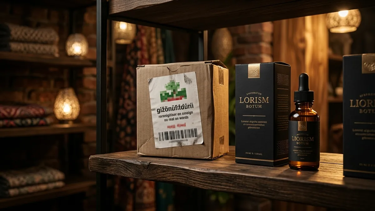
I have seen this pattern repeatedly with food brands, skincare founders, home care product makers and gift brands across Bengaluru, Pune and smaller manufacturing towns. The founder has a product priced at Rs 799 or Rs 1,200. But the packaging has a generic font, a clip-art style logo, colours chosen randomly and a label printed on basic matte paper with no finish. A buyer picks it up, sees the price, and puts it back. Not because of the price. Because the packaging is not telling a story that justifies that price.
The most common mistake I see is treating packaging as a cost to minimise rather than an investment that sells. Business owners call three or four vendors, pick the cheapest one and move on. The vendor delivers something functional. It has your brand name on it. It lists the ingredients or features. But it does not create any emotion. It does not make a buyer feel that this product is for them, that it is trustworthy, that it is worth the money. Functional packaging and selling packaging are very different things.
Colour is usually where things fall apart first. Many Indian product founders choose colours based on personal preference or what looks bright on a screen. They do not think about what the colour signals to a buyer in their category. In skincare, certain palettes say clinical and safe. Others say luxury. In food, some colours trigger appetite and freshness. Others feel processed or artificial. If your colour palette is mismatched to your category or your target buyer's expectations, the product will feel off even if the buyer cannot explain why. This connects closely to what I discuss with founders in my one-to-one consultation — colour decisions in packaging are never purely aesthetic. They are strategic.
Typography is the second silent killer. When a packaging layout uses three or four different fonts in different weights and sizes, the result looks cluttered and unconfident. Premium packaging almost always uses restraint. One strong typeface family. Clear hierarchy. Enough white space for the eye to rest. When I look at a product label that is trying to say everything at once — the benefits, the certifications, the founder story, the usage instructions — all in the same visual weight, it tells me the brand does not know what its most important message is. That confusion transfers directly to the buyer.
Then there is the print quality problem. A beautifully designed label loses everything when it is printed on thin paper stock with no lamination, no spot UV, no emboss — nothing that gives it a tactile premium feel. Buyers touch packaging. That touch either reinforces the visual promise or immediately contradicts it. I often recommend founders spend less on the total number of SKUs they launch and more on getting one product's packaging absolutely right — the right stock, the right finish, the right print quality. Prove the concept first. If you want to understand how to prioritise these decisions across your brand, the business growth workshops I run cover exactly this kind of brand-to-market thinking for product businesses.
If you are selling online, the problem compounds. Your product thumbnail on a marketplace or your website is competing with dozens of visually polished alternatives. The photograph of your packaging needs to look intentional, well-lit and shelf-worthy even on a four-inch mobile screen. Many Indian product founders shoot their own packaging against a cluttered background or use the vendor's stock photo. That is the moment you lose a buyer who would have otherwise converted. Good packaging needs good photography. Both matter.
What can you do this month? Start by printing your packaging label and placing it next to two or three competitors — either products you buy yourself or images you find online. Look at them together without reading anything. Just look. Ask yourself honestly which one you would pick up first and which one you would pay more for. That gap between your packaging and the best in your category is your brief for redesign. You do not need to rebuild everything at once. Start with the label or the outer box. Get the colour, typography and finish right. Then move to everything else. If you want a proper eye on this, feel free to reach out through the contact page and we can take a closer look at what your packaging is currently communicating.
Want to understand where your business growth is stuck?
Book a Business Growth Diagnostic with Abhijit JK — an honest, focused 60-minute one-to-one session with Abhijit JK on your brand, website and growth.
Book a Business Growth Diagnostic