Why Your Logo Is Not Making Your Business Look Credible
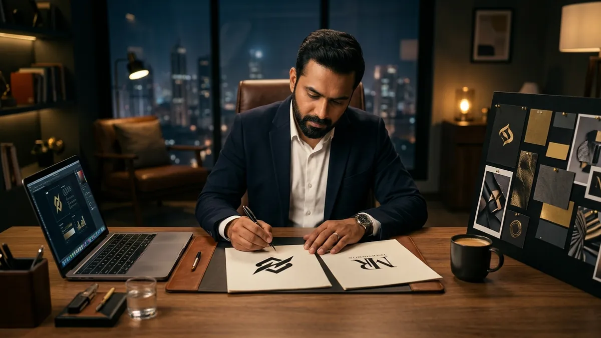
Most business owners I meet tell me the same thing. 'My logo is fine. We got it made years ago and it works.' Then I ask them: when did you last show it to a new customer and watch their reaction? Not their words — their face. That pause before they say 'nice' tells you everything.
Your logo is not just a symbol. It is a first impression that arrives before you open your mouth. Before a buyer reads your proposal, visits your office or takes your call — they have already seen your logo on your card, your invoice, your social media or your signage. In that half-second, they decide whether you look like someone they should take seriously or someone they should negotiate hard with.
Here is what I see again and again with manufacturers, traders and service businesses in India. The logo was made in a hurry — given to a local printing shop or a college student who charged three thousand rupees. The brief was simple: 'make something nice with our name.' The result is a logo that has a globe, or gears, or a swoosh, or a rising sun — all of which mean nothing specific to anyone. It looks like every other business in that category. Interchangeable. Forgettable.
There is another version of this problem that is subtler. Some businesses have a logo that looked decent when it was made in 2009. Clean enough for that time. But design sensibility has moved. Buyers — especially younger buyers, procurement managers, urban retail customers — have been exposed to sharper, more refined visual standards. Your old logo now signals that you have not updated yourself. And if you have not updated your logo, what else have you not updated? That is the unconscious question buyers ask without realising it.
I have seen this with a textile manufacturer in Surat who was trying to get into modern retail. Good fabric, fair pricing, solid delivery record. But every buyer meeting ended the same way — they were treated like a commodity supplier, not a brand partner. When we looked at their materials together, the issue was immediate. The logo was in a heavy red font with a crown graphic and drop shadows. It screamed 1998. No retail buyer was going to put that on their sourcing list alongside brands they admired. We rebuilt the identity — not the business, just how it presented itself. The next round of buyer meetings went differently. If you want to think through something like this for your own business, a one-to-one consultation is often the fastest way to get a clear picture.
So how do you know if your logo is actually hurting you? Ask yourself these questions honestly. Does your logo look different on your website, your letterhead, your social profile and your visiting card — because nobody kept a proper file and everyone resized it differently? Do you use a JPEG of your logo that gets pixelated when printed large? Have you ever felt slightly embarrassed handing over your card to a senior executive? Does your logo use more than three colours and three fonts? Does it try to show everything your business does inside one symbol? If you answered yes to even two of these, you have a credibility problem sitting at the front door of your business.
The fix is not always a complete redesign. Sometimes it is simply getting a clean, properly built vector file of your existing logo. Sometimes it is removing one colour, simplifying the icon, or updating the typeface. Sometimes it is starting fresh because the original was built on no thinking at all. The decision depends on how established your current identity is and how misaligned it is with where you want to take the business. I cover this kind of diagnostic work in my business growth workshops, where founders often realise that visual identity decisions are actually positioning decisions in disguise.
What you want from a logo is not beauty for its own sake. You want it to do three things quietly and consistently. First, it should signal the category you are in — a logistics company and a luxury spa should never look the same. Second, it should signal the level you are operating at — economy, mid-market or premium. Third, it should be reproducible without breaking — on a small social media icon, on a large hoarding, in black and white on a fax or courier label. A logo that cannot do all three is not a logo that is working for your business.
I will say this plainly. If your business is growing and you are moving into better markets, bigger clients or higher price points, your logo will either support that ambition or quietly undermine it. Buyers do not always tell you this. They just choose the other vendor who looked more put together. Fix the front door before you spend more money driving traffic to it. You can start by reviewing everything through the lens of one simple question: does this look like the business I want to be known as, or the business I used to be?
Want to understand where your business growth is stuck?
Book a Business Growth Diagnostic with Abhijit JK — an honest, focused 60-minute one-to-one session with Abhijit JK on your brand, website and growth.
Book a Business Growth Diagnostic