Why Your Business Card Still Cannot Close a Deal
Most business owners I meet carry a business card that cost them two hundred rupees to print at the neighbourhood xerox shop. The name is there. The phone number is there. Sometimes a logo that was designed in twenty minutes on Canva. They hand it out at trade fairs, vendor meetings, networking events — and then wonder why nobody calls. The card is not the problem. What is on the card, and what it communicates about the business, is.
Here is the real function of a business card. It is not a contact sheet. It is a thirty-second brand impression that happens after you leave the room. When someone picks it up the next morning from their desk or jacket pocket, it does one of two things. It either reminds them why they should call you, or it gives them no reason to keep it at all. Most cards I have seen from Indian MSMEs and service businesses do the second thing completely.
The first mistake is too much information. I have seen cards with five phone numbers, two email IDs, a website, a tagline, three services listed, a QR code and a map. The person reading it does not know where to look first. A good business card should have one primary call to action. One number. One email. One clear line that tells the reader what you do and who you do it for. Everything else is noise.
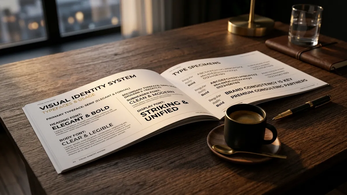
The second mistake is a logo that does not scale. Your logo might look decent on a billboard or a big screen. But on a 3.5 by 2 inch card, it becomes a blurry blob or a cluttered mess. Logo design for a business card is a specific discipline. The mark needs to hold at small sizes, with clean lines and enough negative space around it. If your logo collapses at small sizes, it is telling buyers something about how seriously you take your own brand. I have written about this problem in a broader context — how visual identity choices signal trust or doubt to buyers before a single word is spoken.
The third mistake is treating the back of the card as wasted space. Most cards I see have a blank back, or a faded repeat of the front. That back side is free real estate. Use it. A manufacturer I worked with put one strong sentence on the back of his card — the number of years his factory had been running and the states they supplied to. That single line changed how distributors perceived him at trade meets. It answered the silent question every buyer has: can I trust this person to deliver?
Colour and typography choices matter more than most founders realise. A card printed in a muddy dark colour with white text that is 7pt font size is nearly unreadable under most lighting. A card with three different fonts looks like nobody took a decision. These are not aesthetic preferences. They are signals. Buyers — especially in B2B contexts — are making micro-judgements about your professionalism from the moment your card lands in their hand. If you are not sure where to start with these choices, a one-to-one consultation helps you make decisions based on your specific industry and buyer profile rather than guessing.
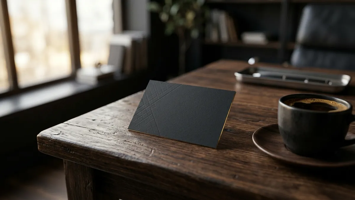
Paper stock and finish are the silent quality signal most founders skip to save money. The difference between a 250 GSM matt laminated card and a flimsy 130 GSM printed sheet is felt in the hand within one second. Premium buyers — architects, interior designers, corporate procurement teams, export buyers — are conditioned to notice material quality. If you are pitching a premium product or service and handing out a thin card, there is a mismatch. That mismatch costs you positioning before the conversation even starts. You do not need to spend a fortune. But you do need to make a deliberate choice.
Some founders ask me whether business cards are still relevant when everyone is exchanging numbers on WhatsApp. My answer is always yes — but with conditions. The card works when it is backed by a consistent identity. If your card looks one way, your letterhead looks another way, your Instagram bio has a different colour palette and your website uses yet another font, the card becomes meaningless. It is just a piece of paper. The card only works as part of a larger visual system that is coherent everywhere a buyer encounters you. This is the exact thing I cover in business growth workshops when we work through the identity layer of a business.
If you want to fix your business card this month, here is a practical starting point. Pull out your current card and ask four questions. One — does the card tell someone in five seconds what I do and who I serve? Two — is there one clear action they can take after reading it? Three — does it look and feel consistent with how my business appears online? Four — would I be proud to hand this to my most valuable potential client? If any answer is no, the card needs a rethink — not a reprint. A redesign done properly, as part of a clear visual identity, will earn back its cost in the first serious conversation it supports. You can learn more about how I approach this work on the about Abhijit page.
Want to understand where your business growth is stuck?
Book a Business Growth Diagnostic with Abhijit JK — an honest, focused 60-minute one-to-one session with Abhijit JK on your brand, website and growth.
Book a Business Growth Diagnostic