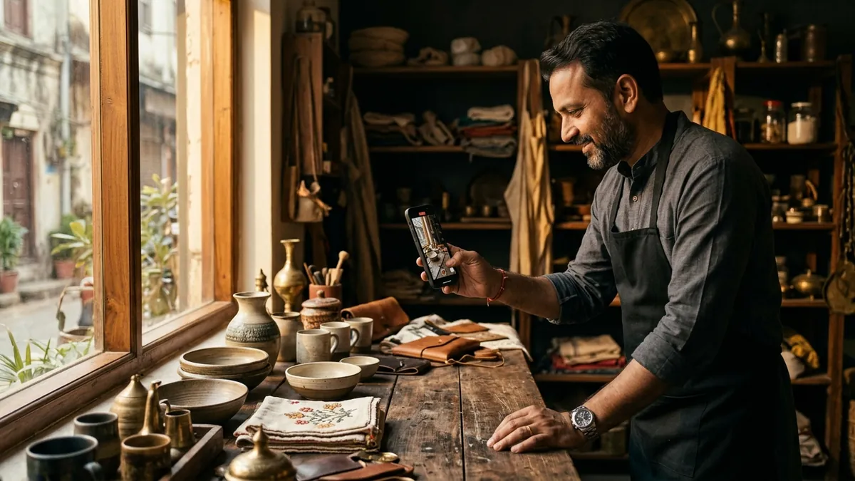
Why Your Typography Is Making Buyers Trust You Less
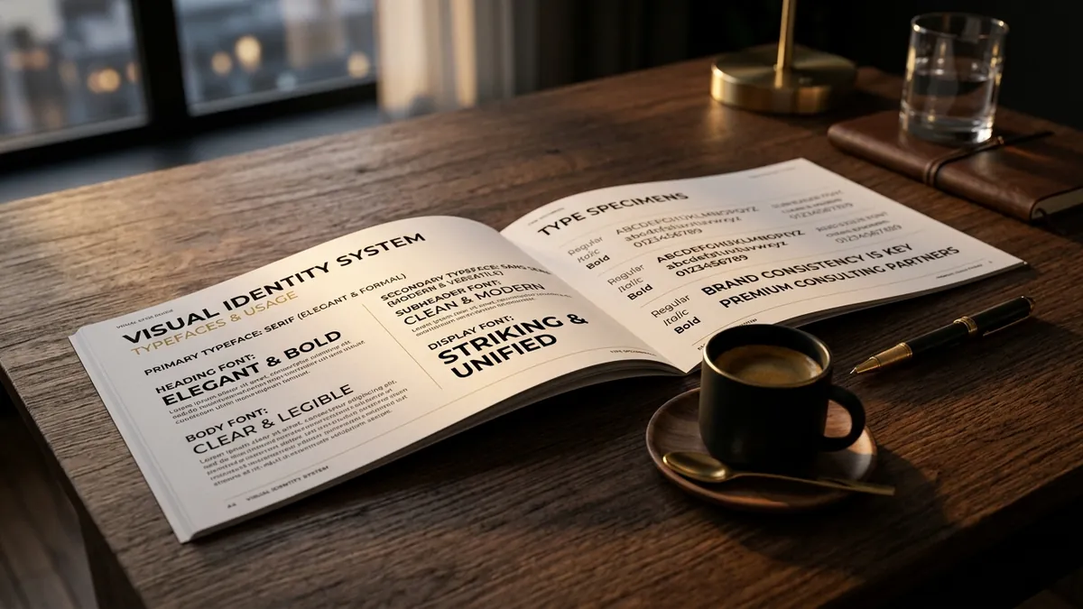
Most business owners I meet have spent real money on a logo. Some have even hired someone to define their brand colours. But when I look at their brochures, websites, packaging and presentations, the fonts are all over the place. Three different typefaces on one page. Body text in a decorative script. Headings in a free font downloaded from some random website. And they wonder why buyers are not taking them seriously.
Typography is not a design hobby. It is a trust signal. When someone reads your proposal, visits your website or picks up your product, their brain is scanning everything — including the way your words look. Inconsistent or inappropriate fonts register as carelessness. And carelessness in your design makes buyers wonder if you are careless in your work too. That is the silent damage bad typography does.
I have seen this pattern with manufacturers especially. They produce genuinely good-quality products. But the sticker on the bottle or the label on the carton uses a bold display font for the body text, a mismatched serif for the product name and a default system font for the contact details. The product is solid. The packaging looks put together in a hurry. A buyer comparing two options on a pharmacy shelf will pick the one that looks more considered — every time.
The most common mistake I see is confusing decorative with premium. Script fonts, calligraphic typefaces, ornate lettering — these feel fancy to many founders. So they use them everywhere. But premium brands use restraint. They use clean, well-spaced, readable fonts that let the content breathe. Think of any brand you genuinely consider high quality. Their typography is almost always quiet and confident, not loud and decorative.
There is also the mixing problem. A business will use one font on their letterhead, a completely different one on their website, another on their social media posts and whatever default Word uses on their quotations. Each touchpoint looks like it belongs to a different company. Buyers do not consciously notice this, but they feel it. The brand feels scattered. It does not feel like a company that has its act together. If you have been struggling with this, it connects directly to the kind of work we discuss in my one-to-one consultation — where we look at every customer-facing surface and find what is silently costing you.
Fixing your typography does not require a design degree. Start with two fonts maximum for your brand — one for headings, one for body text. Choose a pairing that has contrast but harmony. A strong sans-serif for headings with a clean, readable serif for body text is a combination that works across industries. Stick to this combination across your website, presentations, packaging and social media templates. Consistency alone will make your brand feel more professional than 80 percent of your competitors.
Also pay attention to sizing and spacing. Many businesses cram too much text into too little space with tight line spacing. White space is not wasted space — it is breathing room that signals confidence. A brand that is not afraid to leave space feels more premium than one that fills every corner with information. This is something I cover in depth during business growth workshops when we work on brand presentation materials with MSME teams.
One practical step you can take this month: open your most-used customer document — your proposal, your brochure or your website homepage — and count how many different fonts appear. If the number is more than two, you have a typography problem worth solving. Then look at whether any of those fonts are decorative scripts being used for body text. Fix these two things and the document will immediately look more credible, without changing a single word.
Good typography is not about being a design expert. It is about making deliberate choices and being consistent with them. Buyers are not typographers. They cannot name what looks wrong. But they can feel when something looks trustworthy and when something does not. Your font is quietly speaking on your behalf even before a buyer reads a single word. Make sure it is saying the right thing. If you want to audit your brand materials and see what is working against you, start with the contact page and let us look at it together.
Want to understand where your business growth is stuck?
Book a Business Growth Diagnostic with Abhijit JK — an honest, focused 60-minute one-to-one session with Abhijit JK on your brand, website and growth.
Book a Business Growth Diagnostic