Why Your Packaging Looks Cheap Even When the Product Is Not
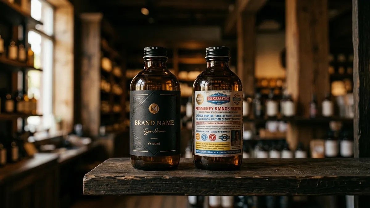
A manufacturer in Mysuru once showed me his product next to a competitor's on a retail shelf. His product was genuinely better — better ingredients, better process, better shelf life. The competitor's version was average at best. But every retailer was pushing the competitor's product. The reason was sitting right in front of us. His packaging looked like it was designed in 2004 and printed on a tight budget. The other brand looked clean, confident and ready to be picked up.
This is not a rare story. I see it constantly with Indian manufacturers, food brands, home care products, ayurvedic ranges and personal care startups. The founder puts everything into the product and almost nothing into how the product presents itself to a stranger who has never met them. That stranger — the buyer, the retailer, the end customer — makes a decision in about three seconds on a shelf or a screen. Your packaging is doing all the talking in those three seconds.
The most common mistake I see is treating packaging as a printing job rather than a communication job. Founders call a local printer, choose a template, add the product name and some features, pick whatever colours they like, and send it to press. There is no thinking about what emotion the packaging should create, who is picking it up, what they need to feel before they buy, or how it will look next to ten other products. The result is packaging that is technically complete but commercially weak.
Colour is where most packaging goes wrong first. I have worked with food brands that used five different colours on one label because they wanted it to look 'attractive.' The result looked chaotic. Premium brands almost always use restraint — fewer colours, more white space, deliberate contrast. When your packaging uses too many colours without a clear logic, it signals that no one thought carefully about the design. Buyers may not be able to name this feeling, but they feel it. They reach for the other product instead. If you want to understand how colour decisions affect buyer trust, the same principle applies across your entire brand — something I cover in detail during a one-to-one consultation.
Typography is the second big failure point. Most MSME packaging uses bold, decorative or condensed fonts that look heavy and cluttered. The hierarchy is broken — the brand name, product name, tagline, quantity, ingredients and certifications all fight for attention at the same size. A buyer cannot find what they are looking for quickly. When information is hard to read, it feels untrustworthy. Premium packaging has a clear reading order. Brand name first. Product name second. Supporting information third. Everything else quietly in the background. This is not complicated design — it is disciplined design.
Photography and illustration quality tells the buyer everything about how seriously you take your product. I have seen printed packaging where the product image looks like it was photographed on a phone in poor lighting and then stretched slightly to fit the layout. That single image destroys the credibility of everything else on the pack. If your budget does not allow professional photography right now, use clean typographic packaging instead. A well-designed text-led pack looks far more premium than a poorly photographed product-led one. This is a principle that applies to your digital presence too — your website, catalogue and social media all suffer from the same problem if you skip proper visual work.
Material and finish choices matter more than founders realise. A good design printed on cheap paper stock or with a lamination that peels at the edges will undo all the design effort. I have reviewed packaging where the design was actually decent but the printing was inconsistent — colours shifted between batches, the die-cut edges were rough, the sticker placement was uneven. These are not small details to a buyer who sees hundreds of products. These details tell them whether this is a brand that cares or a brand that cuts corners. If your product is genuinely good, your packaging needs to make that same promise. If you are unsure where your packaging currently stands, bring it to one of my business growth workshops — we do live brand audits that include packaging and visual identity reviews.
There is also the digital shelf problem that is growing fast. Most buyers in India today discover products on Instagram, Flipkart, Amazon, Meesho or WhatsApp before they ever see them physically. Your packaging needs to look good in a 400x400 pixel thumbnail, not just in a physical retail setting. Small text becomes unreadable. Busy backgrounds disappear. The brand name gets lost. Founders who design packaging only for the physical shelf are losing the digital discovery battle before it even starts. Design for the thumbnail first and the shelf second — that is the right order in 2025.
The fix is not always expensive. I have helped businesses transform their packaging perception with a cleaner layout, a reduced colour palette, better font choices and a one-time investment in proper product photography. The printing cost did not change significantly. What changed was the intent behind the design. If you want an honest look at what your packaging is currently communicating to buyers, start at about Abhijit to understand how I approach these problems, or reach out directly through contact. A product that is genuinely good deserves packaging that says so without you needing to be in the room to explain it.
Want to understand where your business growth is stuck?
Book a Business Growth Diagnostic with Abhijit JK — an honest, focused 60-minute one-to-one session with Abhijit JK on your brand, website and growth.
Book a Business Growth Diagnostic