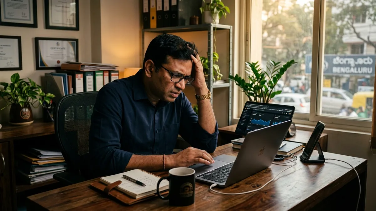
Why Your Visual Identity Looks Different Everywhere
Most business owners I meet have a decent logo. They have a colour they like. They have a font someone used on their first brochure. But when I look at their Instagram, their website, their WhatsApp catalogue and their visiting card side by side, they all look like they belong to four different companies. This is one of the most common and most quietly damaging problems I see with Indian MSMEs and growing businesses.
The damage is not always obvious. Buyers do not usually say, 'Your brand looks inconsistent.' They just feel something is off. They feel like the business is disorganised, or too small, or not serious enough. They move on. They choose the competitor who looks more put-together, even if that competitor is offering a weaker product. This is the invisible cost of poor visual identity consistency.
Let me give you a real example. I worked with a textile manufacturer in Surat who had good quality fabric, fair pricing and fast delivery. But his Instagram had one font, his catalogue had another, his website was built by a nephew and used completely different colours, and his WhatsApp display picture was a blurry photo of the factory. When a buyer in Mumbai was comparing him to a similar supplier, the other supplier simply looked more organised online. The Surat manufacturer lost the enquiry and never understood why. It was not price. It was not quality. It was design inconsistency.
The root cause I see most often is this: things were built one at a time, by different people, with no shared reference point. The logo was made first. Then a social media person came on board and picked colours they liked. Then someone else built the website. Then a printer designed the brochure using whatever fonts they had. Nobody was wrong individually. But nobody was working from the same visual system. If you want to understand how this connects to your overall brand perception, the about Abhijit page gives some context on how I approach this for businesses.
The fix is not as expensive or complicated as people think. It starts with creating what I call a one-page brand reference sheet. Not a 40-page brand guidelines document. Just one page that clearly documents four things: your exact logo file and the space around it, your two or three brand colours with their hex codes, your one or two fonts including where to download them, and basic rules like 'never stretch the logo' or 'always use white background for the logo on dark surfaces.' This single sheet, shared with every vendor, designer, social media person and intern, will solve 70 percent of the consistency problem within one month.
The second thing I recommend is doing a visual audit before you do anything else. Open your Instagram profile, your website homepage, your latest brochure PDF, and your most recent WhatsApp catalogue or price list, all at the same time. Look at them together. Ask yourself honestly: do these look like they came from the same business? If the answer is no, you know what needs fixing. I run this kind of audit exercise in my business growth workshops because it is always a revelation for founders who have never seen their own brand through a buyer's eyes.
One thing that surprises many business owners is how much colour alone drives consistency. If your Instagram uses light blue and white but your brochure uses dark green and gold, the brand feels fragmented even if everything else is well-designed. Pick your two primary colours and use them everywhere, every time, without exception. Typography is the second biggest offender. Using three or four different fonts across materials looks amateurish. Two fonts — one for headings, one for body text — is enough for most businesses. If you are unsure which fonts to pick, look at established brands in your industry and notice what feels clean and readable.
For founders who want tailored help walking through this for their specific business, a one-to-one consultation is usually the fastest way to get a clear plan. I have done this with manufacturers, service businesses, retail shops and exporters. Every category has slightly different needs, but the core problem is almost always the same — visuals created without a system, by multiple hands, with no shared reference. The good news is it is fixable without a full rebrand or a large design budget.
The businesses that look premium — even when they are not the biggest — are not always the ones with the fanciest logo. They are the ones who look the same everywhere a buyer encounters them. Same colours. Same fonts. Same quality of photography. Same tone of voice in captions and copy. That coherence is what creates the feeling of a serious, trustworthy business. It takes discipline more than money. Start this month by building that one-page reference sheet and auditing every place your brand appears publicly. You will find at least three things to fix immediately. Fix them, and watch how buyers start responding differently.
Want to understand where your business growth is stuck?
Book a Business Growth Diagnostic with Abhijit JK — an honest, focused 60-minute one-to-one session with Abhijit JK on your brand, website and growth.
Book a Business Growth Diagnostic