Why Your Brand Colours Are Costing You Customers
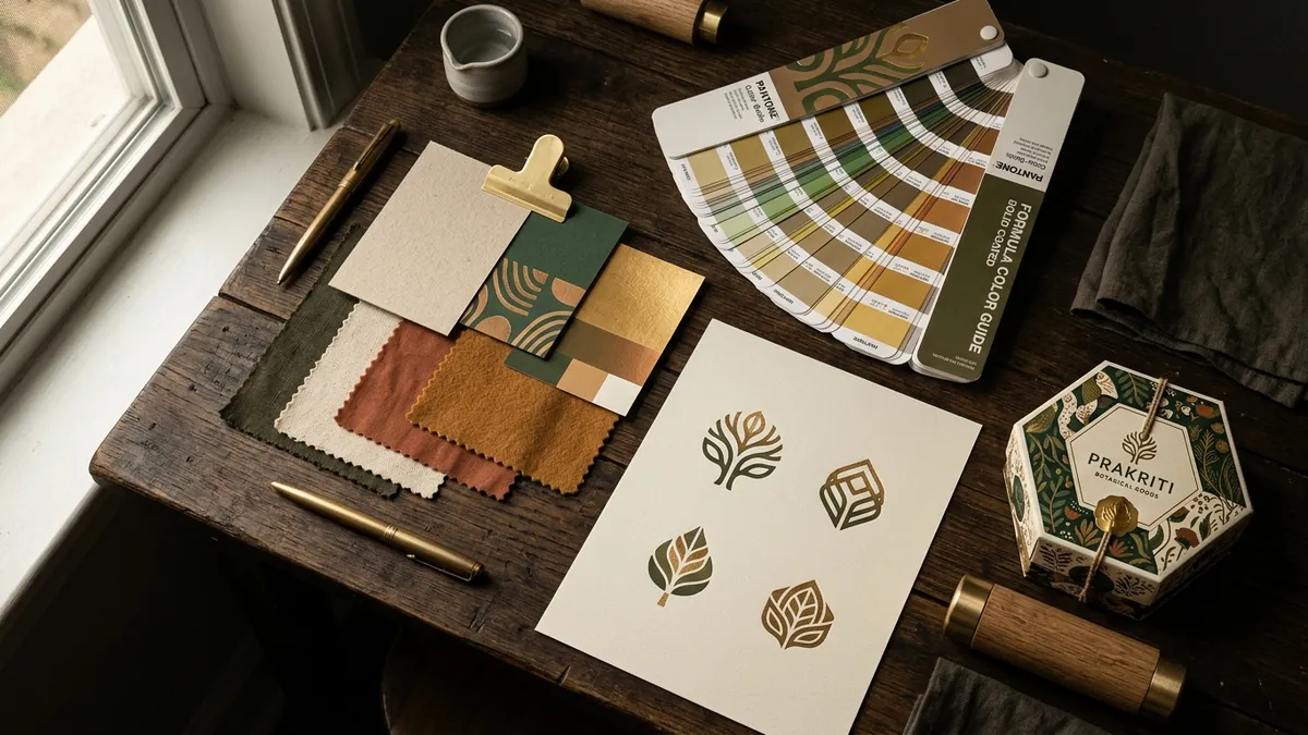
Most business owners I meet chose their brand colour the same way. They opened a design app, picked something that looked nice, or went with their personal favourite. Blue because it looked professional. Green because it felt fresh. Orange because someone said it was energetic. The colour stuck. It went on the logo, the signage, the packaging, the social media pages. And now, years later, they wonder why customers do not associate a strong feeling with their brand — or worse, why certain buyers do not take them seriously at all.
Colour is not decoration. It is the first signal your brand sends before anyone reads a single word. A buyer sees your Instagram post, your shop front, or your product on a shelf. In under two seconds, the colour tells them whether this brand is for them or not. Whether it feels trustworthy or risky. Whether it matches the quality they expect to pay for. That decision happens below conscious thought. By the time they start reading your caption or checking your price, colour has already done its work — for you or against you.
I have seen this play out repeatedly with manufacturers and product businesses. A spice brand in a mid-market city used bright neon packaging because the owner liked bold colours. The product quality was genuinely excellent. But on a retail shelf next to organised brands, it looked like a cheap imitation. Shopkeepers placed it at the bottom shelf. Buyers reaching for a gift option ignored it. Nothing about the product changed. Only the packaging colour and design were reworked — shifted to warm earthy reds and deep ochres that matched the product's traditional positioning. Sales at the same outlets improved within sixty days.
The second big mistake I see is using colours that belong to a completely different category or audience. A B2B industrial equipment supplier using pastel pinks and mint greens. A premium skincare brand using the same colour palette as a local pharmacy. A coaching business for senior professionals using the same neon gradient style as a college-fest poster. These colour mismatches create a small but persistent friction in the buyer's mind. They cannot always name what feels off — they just sense that the brand does not quite fit where it claims to belong. And when buyers feel uncertain, they default to whoever feels most familiar and most credible.
Choosing the right colour starts with understanding three things about your business: who your best buyer is, what category you operate in, and what emotional territory you want to own. A luxury service — legal advisory, architecture, high-end hospitality — typically earns trust through restrained palettes. Deep navy, warm charcoal, burgundy, gold used sparingly. A health and wellness brand earns trust through clean, natural tones. Sage greens, soft terracottas, off-whites. A children's brand can afford joy and brightness. But even within these broad signals, the specific shade, saturation and combination you use decides whether your brand looks considered or accidental. If you are not sure where your brand stands on this, a one-to-one consultation can help you audit what your current colours are actually communicating to buyers.
Consistency is the other half of the problem. Many founders do get their brand colour right at the beginning — but then it drifts. The printer uses a slightly different shade. The social media designer picks something close but not exact. The WhatsApp catalogue has a slightly brighter version. The visiting card looks different from the website header. Each deviation is small. Together they add up to a brand that looks assembled from different places rather than intentional. Buyers may not consciously notice, but they feel the inconsistency as a lack of professionalism. Your competitors who show up with tight colour discipline look more established, even if their actual work is no better than yours.
The fix for colour drift is simpler than most founders expect. You need a short, written brand colour guide — even a one-page document — that specifies your exact primary colour in HEX code for screens and Pantone or CMYK values for print. Every vendor, every designer, every in-house team member refers to the same document. No more picking by eye. No more 'close enough.' This one discipline change, done consistently over six months, transforms how your brand looks across every touchpoint. I cover this in detail during business growth workshops for MSME founders who want practical tools they can implement immediately.
One more thing that founders often miss: your brand colour needs to work in black and white too. On a newspaper ad, a government registration certificate, a rubber stamp, an embossed letterhead. If your brand only works in colour, it is incomplete. Test your logo and key visuals in greyscale. If the hierarchy and identity still read clearly, your colour system has good bones. If it collapses into a grey blob, the underlying design needs strengthening before colour becomes a crutch.
Colour is one of the cheapest and highest-leverage brand decisions you can make. It does not require a rebrand. It does not require a large budget. It requires clarity on who you are for, discipline in application, and the patience to stay consistent long enough for buyers to associate that colour with your name. Most businesses never get there — not because they lack resources, but because no one ever told them that colour was doing serious business work all along. Now you know. Start with your brand colour guide this month. If you want a second pair of eyes on what your current palette is actually saying about your business, you are welcome to contact me directly.
Want to understand where your business growth is stuck?
Book a Business Growth Diagnostic with Abhijit JK — an honest, focused 60-minute one-to-one session with Abhijit JK on your brand, website and growth.
Book a Business Growth Diagnostic