Why Your Packaging Design Is Losing You Shelf Space
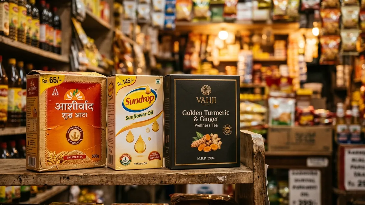
Walk into any general trade store or modern retail outlet in India and observe what a buyer does. They do not read every label. They scan. Their eyes stop at certain products and skip others entirely. The products that get stopped at are not always the best quality ones. They are the ones with packaging that communicates something clearly in about two to three seconds. Most Indian MSME founders I meet have spent years perfecting their product and almost no time thinking about what the outside of that product is saying.
I have worked with manufacturers in Bengaluru, Pune and smaller towns who produce genuinely good products — food items, personal care, industrial goods, home cleaning products. In nearly every case, when they struggled with retail placement or slow offtake, the product itself was not the problem. The packaging was doing nothing for them. It looked like a cost they wanted to minimise, not an asset they wanted to invest in. And retail buyers — whether from a supermarket chain or a local distributor — noticed immediately.
The first thing retail buyers and end customers judge is whether the packaging looks like it belongs on that shelf. This is called shelf compatibility. If your product sits next to three national brands and your packaging looks like it was designed in a hurry, buyers mentally place you in a different, lower category before they even read the price. I have seen this happen with good quality pickle brands, herbal products, spice manufacturers and machine lubricants. The product earns no consideration because the packaging creates the wrong first impression.
There are four things that typically go wrong with packaging design for Indian product brands. First, too much information on the front face. Founders want to tell everything — certifications, ingredients, benefits, taglines, a founder story, social media handles — all on the front panel. The result is visual noise that says nothing clearly. Second, fonts that do not match the positioning. A premium dry fruit brand using a generic free font looks like a commodity. Third, colours chosen out of personal preference instead of category logic. Fourth, no hierarchy — meaning the eye does not know where to go first. The brand name, the product name and the benefit should have a clear reading order. When everything shouts equally, nothing lands.
The fix is not always a complete redesign. Sometimes it is a structured redesign brief that clarifies three things before any designer touches the artwork. One: who is the buyer and what shelf or platform will this product sit on? Two: what is the single most important thing this packaging must communicate in three seconds? Three: what do the top three competitors in this category look like, and how do you want to be positioned relative to them — premium, value or specialist? If you are a founder who wants to think through this clearly before briefing a designer, a one-to-one consultation can help you build that brief so the design work starts in the right direction.
Packaging also fails when founders treat it as a one-time exercise done at product launch and never revisited. Markets shift. Retail channels evolve. A packaging design done five years ago for general trade may not work for quick commerce or modern retail today. I have worked with brands that were doing reasonably well in local markets and wanted to enter organised retail or e-commerce, only to realise their packaging needed a full redesign to even get a listing conversation started. The category looks different online than it does on a physical shelf. Online, your packaging is a thumbnail. If it does not communicate clearly at small size, you are invisible.
One thing that surprises many product founders is how much the material choice communicates before the design even starts. A premium product in a flimsy pouch or a commodity-looking label stock will fight against itself. The design can only do so much if the substrate, finish and structure are working against the positioning. Matte lamination versus gloss, soft touch finishes, kraft paper versus white board — these are not just aesthetic choices. They are brand language decisions. I regularly see manufacturers allocate budget to digital ads while cutting costs on packaging material, and then wonder why their product does not look as good as the competitor's in a buyer's hand.
If you are a product founder preparing for retail expansion, a trade show, an export inquiry or an e-commerce listing this year, packaging design is not a background task. It is a sales tool. I run business growth workshops where product founders work through exactly this — how to brief and evaluate packaging design as a commercial decision, not just an aesthetic one. The goal is always the same: a buyer should pick up your product before they know your price, because the packaging earned that consideration.
Start this month by doing one simple exercise. Put your product next to the top three competitors in your category. Look at them from one metre away for three seconds. Then ask someone who does not know your business which product they would pick up first and why. The answer will tell you everything you need to know about where your packaging design stands today — and what needs to change before your next production run.
Want to understand where your business growth is stuck?
Book a Business Growth Diagnostic with Abhijit JK — an honest, focused 60-minute one-to-one session with Abhijit JK on your brand, website and growth.
Book a Business Growth Diagnostic