Why Your Website Has No Clear Call to Action
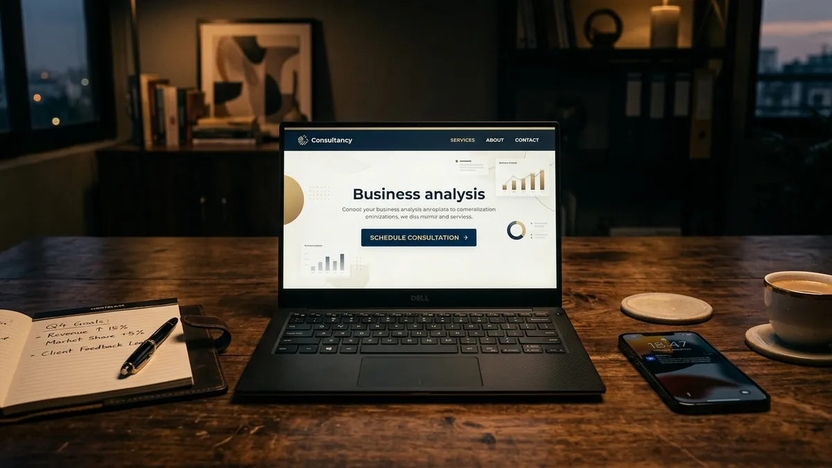
Most business owners I meet have spent a reasonable amount of money building their website. The design looks clean. The services are listed. There are even some photos from the factory or the office. But the phone does not ring. The contact form sits empty for weeks. And the owner tells me, 'I think people just are not searching for what we do.' That is almost never the real problem. The real problem is that the website does not tell the visitor what to do next.
A call to action — or CTA — is simply an instruction that tells the person reading your website what step to take right now. Call us. Request a quote. Book a free consultation. Download the brochure. It sounds obvious. But I have audited hundreds of Indian business websites and the majority either have no CTA at all, or they have five different ones placed randomly, which is just as bad. When everything is asking for attention, nothing gets it.
Here is what I see most often. A manufacturer's website will have a home page with a hero image, three paragraphs about the company, a list of product categories, some client logos, and a footer with a phone number in small grey text. Somewhere in the middle there is a button that says 'Know More.' Know more about what? That button goes to the About page. The visitor came to the site with a real need, spent thirty seconds looking around, found nothing that spoke to them directly, and left. This happens hundreds of times a day on websites that took months to build.
The fix is not complicated but it does require you to make a decision. You need to pick ONE primary action you want every visitor to take. Just one. For most B2B businesses in India, that action is either 'Request a Quote' or 'Book a Call.' For a retail or D2C brand it might be 'Shop Now' or 'Get an Offer.' For a service business it could be 'Book a Free Consultation.' Once you have decided, that one action needs to appear prominently — in the top navigation, in the hero section above the fold, and again at the bottom of the page. If someone scrolls your entire website and still wants to take action, do not make them hunt for a way to reach you.
The words on the button matter more than most founders realise. 'Submit' tells me nothing. 'Contact Us' is tired and vague. But 'Get a Free Quote in 24 Hours' or 'Talk to Our Team Today' — these work because they answer an unspoken question the visitor has: what happens when I click this? Be specific about what you are offering and how fast they will hear back. I have seen simple changes to button text increase enquiry form fills by thirty to forty percent on the same website, without changing anything else. Words do the work.
Another mistake I see, especially with service businesses and consultants, is burying the CTA below three screens of content. You are asking the visitor to read everything before you give them a chance to act. Some visitors are ready to enquire the moment they land on your page. Do not make them scroll to find you. The CTA should be visible without any scrolling on desktop and within the first two swipes on mobile. In India, over seventy percent of website traffic now comes from mobile phones. If your CTA is buried or the button is too small to tap easily, you are losing those enquiries every single day. If you want a proper review of how your website is performing on this front, a one-to-one consultation can save you a lot of guesswork.
There is also the issue of mixed messages. I worked with a training institute that had six different CTAs on their home page — 'Download Brochure,' 'Enrol Now,' 'Call Us,' 'WhatsApp Us,' 'View Courses,' and 'Meet Our Faculty.' Every option dilutes the others. The visitor does not know which is most important, so they do nothing. This is what psychologists call decision paralysis and it is costing Indian businesses crores in lost enquiries. Pick your primary CTA. Put everything else in secondary positions — smaller text, lower on the page, or inside specific sections where they genuinely belong.
One thing worth doing this month: open your website on your own phone and pretend you are a first-time visitor. You have never heard of your business before. You landed here from a Google search. Ask yourself — within five seconds, do I know what this business does and what I should do next? If the answer is no, or even maybe, then your CTA needs work. You can also ask a friend or family member who is not familiar with your business to do the same and tell you honestly what confused them. Most founders are shocked by what they hear. If you are not sure where to start on fixing this, I run business growth workshops where we work through exactly this kind of website communication problem with a room full of founders in the same boat.
A website without a clear call to action is like a shop with no counter and no staff — people walk in, look around, and walk out because nobody asked them how they could help. Your website is your best salesperson. It works twenty-four hours a day, seven days a week, and it never asks for a salary. But it only works if you tell it what to say. Spend one hour this week on your home page. Write one clear CTA. Put it where people can see it. That one change, done properly, can shift your enquiry count more than any new feature or redesign ever will.
Want to understand where your business growth is stuck?
Book a Business Growth Diagnostic with Abhijit JK — an honest, focused 60-minute one-to-one session with Abhijit JK on your brand, website and growth.
Book a Business Growth Diagnostic