Why Your Packaging Loses the Sale Before Anyone Opens the Box
Most business owners I meet spend months perfecting their product. The formula, the quality, the sourcing — all of it gets obsessed over. Then the packaging gets decided in three days because there is a shipment deadline. That is the moment the sale starts slipping away, and nobody notices until returns go up and repeat orders stop coming.
Here is the uncomfortable truth about packaging. The buyer's decision happens in under four seconds. On a shelf, in a delivery box, in a WhatsApp photo from a retailer — that first look either builds trust or kills it. Your product does not get a chance to defend itself. The packaging speaks first, and it speaks loudly.
I have worked with manufacturers in food, personal care, hardware and gifting — and across all of them, I see the same pattern. The packaging looks like it was designed by the printer who printed it. Generic fonts. Clip-art style icons. A colour that was chosen because it 'looked nice' to someone's cousin. No clear hierarchy of information. The product name, the quantity, the benefit, the contact number — all competing for attention at the same size. The buyer's eye does not know where to go, so it goes nowhere, and the buyer moves on.
Let me break down the specific mistakes that cost Indian product businesses the most. First, using too many colours without a system. Launching three variants and making each one a completely different colour scheme is not variety — it looks like three unrelated products from three different companies. A family of products should feel related even when they are distinct. Second, putting the business owner's face or a generic stock image as the main visual. Unless you are a personal brand built around a chef or a health expert, a face on packaging does not communicate product quality. Third, printing on low-quality material to save per-unit cost, then pricing the product at a premium. The material itself signals value. If the box feels flimsy, the product inside feels cheaper than it is, regardless of what is inside.
There is also a typography problem specific to Indian packaging. Many brands use English script fonts — those cursive, swirling styles — because they look 'premium'. But those fonts are almost always illegible at small sizes and completely unreadable on curved surfaces or at shelf distance. If a buyer cannot read your product name in two seconds, you have already lost. Legibility is not a design compromise. It is the foundation. I have written about how typography affects buyer trust in other contexts, and the same rules apply to packaging — possibly even more so. If you are serious about fixing this, a one-to-one consultation is often the fastest way to identify what is actually hurting your packaging before the next production run.
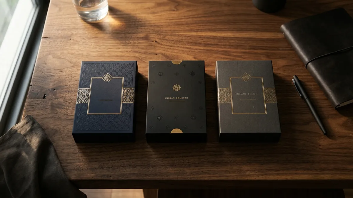
Now let us talk about what premium packaging actually requires — because it is not about spending more money necessarily. It is about making intentional decisions. A single-colour, well-structured, cleanly printed pack can outperform a heavily designed, foil-stamped pack that has no visual logic. What buyers actually read as premium is: clear hierarchy (I know instantly what this product is and why I should care), consistent brand elements (font, colour, logo used the same way every time), honest photography or illustration that shows the product accurately, and material that matches the price point. A Rs 200 product and a Rs 2000 product should not feel like the same packaging decision.
For D2C businesses selling through Instagram, WhatsApp or their own website, the packaging challenge is slightly different. The first impression is often a photo on a phone screen, not a physical shelf. This means your packaging needs to photograph well in natural light. High contrast between background and text, a clear product name that reads even when the image is shrunk to thumbnail size, and a packaging shape or colour that pops against a white or wooden surface — these are not aesthetic luxuries. They are the difference between an enquiry and a scroll past. I run business growth workshops where product founders often realise for the first time how much their packaging photography is undermining otherwise decent packaging design.
If you want to audit your own packaging today, do this one exercise. Put your product next to your top two competitors — either physically at a store or side by side in photos. Do not look at it as the owner who knows what is inside. Look at it as a buyer seeing all three for the first time. Which one looks like it was made by a company that cares? Which one would you pick up first? The answer is usually honest and usually uncomfortable. But it is the starting point for fixing the problem.
Packaging is not decoration. It is a sales tool that works around the clock in every store, every delivery and every unboxing video. If your product is genuinely good, your packaging should match that quality — not undercut it. The investment in getting packaging design right almost always returns faster than any paid advertising campaign, because it fixes a leak that is already costing you sales every single day. If you are ready to look at your brand identity and packaging with fresh eyes, you can start by reading about Abhijit and the kind of work that actually moves the needle for product businesses in India.
Want to understand where your business growth is stuck?
Book a Business Growth Diagnostic with Abhijit JK — an honest, focused 60-minute one-to-one session with Abhijit JK on your brand, website and growth.
Book a Business Growth Diagnostic