Why Your Packaging Looks Cheap Even When Your Product Is Not

I met a food manufacturer in Mysuru last year. Excellent product — handmade, clean ingredients, genuinely better than most national brands. But it was sitting in a plain white pouch with a label printed on a basic inkjet printer at home. He told me retailers were not giving him shelf space and buyers were negotiating his price down to nothing. The product was not the problem. The packaging was doing him serious damage before anyone even tasted what was inside.
Most Indian MSME founders I meet think packaging is just a container. Something functional. A box or a pouch that holds the product until it reaches the customer. But packaging is actually the first salesperson your product ever has. It sits on a shelf, appears in a photo, lands on a customer's doorstep — and it either earns trust or destroys it. Before a single word is read, a buying decision has already started forming.
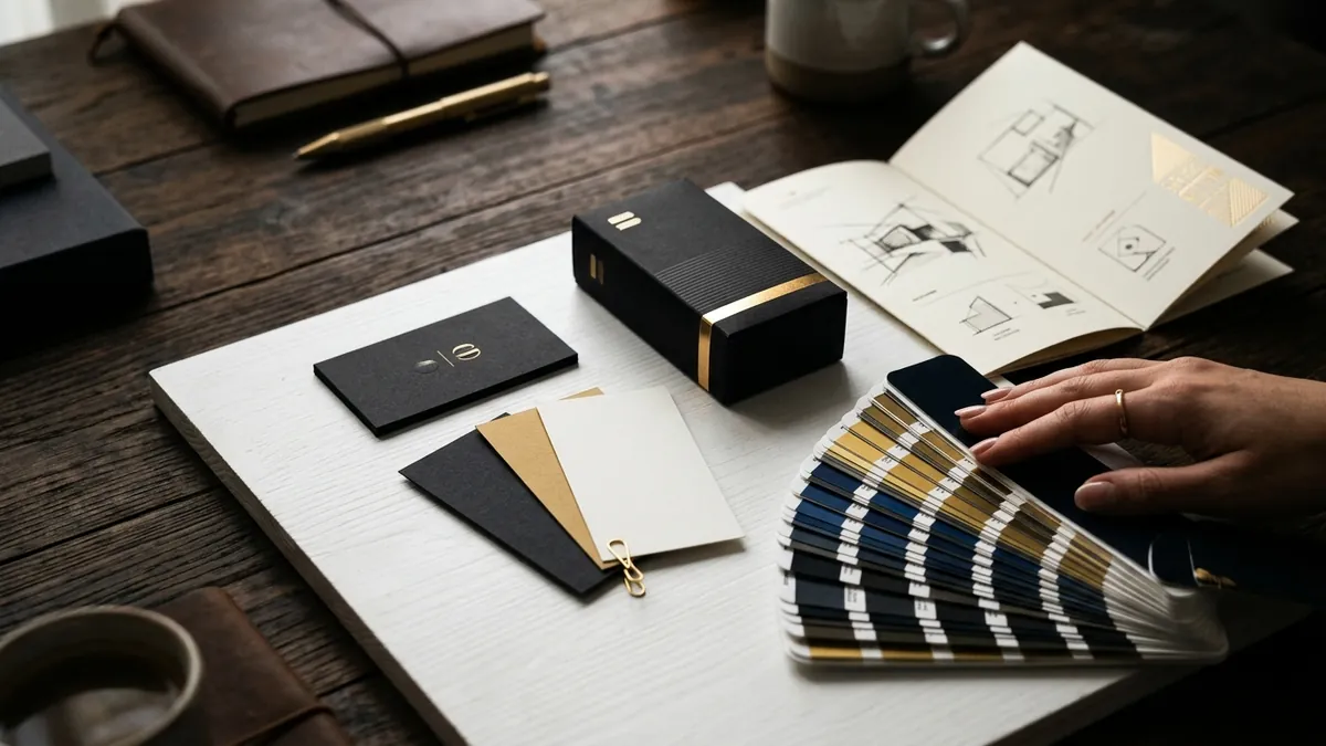
The most common reason packaging looks cheap is not budget. It is the absence of a visual system. Founders pick a font from a free website, choose a colour they personally like, get a stock image from Google, ask a local printer to 'make it look nice' — and then wonder why the result looks amateurish. A premium packaging look comes from deliberate decisions made together: typography, colour palette, finish, hierarchy, spacing. When even one of these is out of place, the whole thing looks off even if the buyer cannot explain why.
Here is something I see constantly with manufacturers and D2C brands. They invest ten to fifteen lakhs in production, machinery or inventory — and then spend two thousand rupees on packaging design. Then they spend another twenty thousand on Instagram ads driving traffic to a product that looks like it costs half of what they are charging. That mismatch kills conversion. Buyers make value judgements in under three seconds when they see your product online or on a shelf. Your packaging has to earn that value perception before any copy or claim can do its job.
Typography alone can transform how a package is perceived. I have done this exercise with several clients — we keep everything the same and just change the font and its sizing hierarchy. The result consistently looks more premium even before any other change. Cheap packaging almost always has too many fonts, uneven spacing, font sizes that are too similar to each other, and text that is trying to say everything at once. Premium packaging uses one or two typefaces, gives each piece of information its own visual weight, and leaves breathing room. Whitespace is not wasted space. It is a signal that you are confident enough in your product to not shout.
Colour finish is another thing most founders overlook when briefing a printer. The same design printed matte versus gloss versus soft-touch lamination looks like three completely different price points. Foiling, embossing, spot UV — these are not expensive luxuries reserved for large brands. Many packaging printers in Bengaluru, Mumbai and Pune offer these finishes at reasonable minimum order quantities now. If you have not had this conversation with your printer yet, have it this week. Sometimes a matte finish with a single spot UV on your logo does more for perceived premium than a full redesign.
Consistency matters as much as quality. I regularly work with founders who have updated their packaging once but their Amazon listing still has photos of the old version, their WhatsApp catalogue shows a picture taken in poor lighting, and their Instagram highlights have a third variation from two years ago. Buyers research before they buy. They will see all three versions in a single session and feel uncertain. If you are thinking about how to audit your brand consistency across touchpoints, a one-to-one consultation is usually the fastest way to find where the biggest gaps are and what to fix first.
If you are a founder who is planning a packaging redesign or doing it for the first time, here is a practical starting point. First, shortlist three competitor products that look more premium than yours and write down what specifically makes them look that way — the font style, the colour palette, the label shape, the finish. Second, write a clear brief: your target buyer, the shelf or surface where this product will be seen, the one feeling you want the packaging to create. Third, work with a designer who has done packaging work before — not a generalist who also does wedding invitations. Packaging has its own rules around dimensions, safe zones, barcode placement and print readiness. Get that wrong and the whole job has to be redone. If you want to understand the full brand and identity process that packaging sits inside, the about Abhijit page explains how I approach this with clients.
Your product quality got you to where you are. But packaging is what gets you to the next level — better retail placement, higher price acceptance, more trust from first-time buyers online. The investment required is far smaller than most founders assume, and the revenue impact is far larger than most expect. I have seen manufacturers add forty percent to their selling price after a proper packaging redesign with no change to the product itself. Buyers are not irrational. They are just using the signals available to them. Make sure those signals are working in your favour.
Want to understand where your business growth is stuck?
Book a Business Growth Diagnostic with Abhijit JK — an honest, focused 60-minute one-to-one session with Abhijit JK on your brand, website and growth.
Book a Business Growth Diagnostic