Why Your Packaging Is Losing Sales on the Shelf
Most business owners I meet spend months perfecting their product. The formulation, the quality, the pricing — all of it carefully worked out. Then they put it into a box or pouch that was designed by their printer for free, or copied from a competitor, or built around what was cheapest at the time. And then they wonder why sales are slow even though the product is genuinely good.
Here is what nobody tells product founders early enough: the packaging is not just a container. It is your first salesperson. On a retail shelf, on an e-commerce listing, or even in an unboxing video shared by a customer — your packaging speaks before you do. If it looks generic, crowded, or cheap, the buyer moves on. They do not stop to read what is inside. They do not give you the benefit of the doubt.
I have seen this repeatedly with food brands, home care products, personal care lines, and even industrial goods sold in B2B settings. A manufacturer from Rajasthan once came to me after spending three years building a premium organic spice range. The quality was exceptional. But his packaging looked like a commodity product you would find at a wholesale market. His margins were terrible because buyers — including modern trade buyers — would not pay a premium for something that did not look premium. The problem was never the product. It was the packaging telling the wrong story.
The most common mistake I see is trying to put everything on the pack. Business owners want to list every benefit, every certification, the founder's name, a tagline, a phone number, a QR code, the ingredients, the USP, and a quote about quality — all on a 100 gram pack. The result is a cluttered surface that communicates nothing. When everything shouts, nothing is heard. Good packaging has a clear visual hierarchy: one strong brand name, one key message, one reason to pick it up. Everything else is secondary.
Colour is where most Indian product brands make the biggest errors. Many founders choose colours based on personal preference or what looks festive. But colour in packaging has a job to do. It signals a category, communicates a mood, and positions you against competitors. A premium skincare brand in pale gold and white reads differently from the same product in bright orange and red. A health food product in earthy greens and kraft brown signals something different from the same product in glossy neon. Before you choose a packaging colour, stand in front of your actual retail shelf — or study your category on a marketplace — and ask: what is everybody using, and how can we stand out while still belonging to the category?
Typography on packaging is equally underestimated. A bad font choice can make a ₹800 product look like a ₹80 product. Fonts that are too decorative become unreadable at small sizes. Fonts that are too generic — the default Word document fonts — make your brand invisible. The font you choose for your brand name on the pack needs to be distinctive enough to be remembered, but clean enough to be read quickly. If you are unsure, this connects directly to how your entire visual identity should be working together — something I cover in depth during one-to-one consultation sessions with product founders.
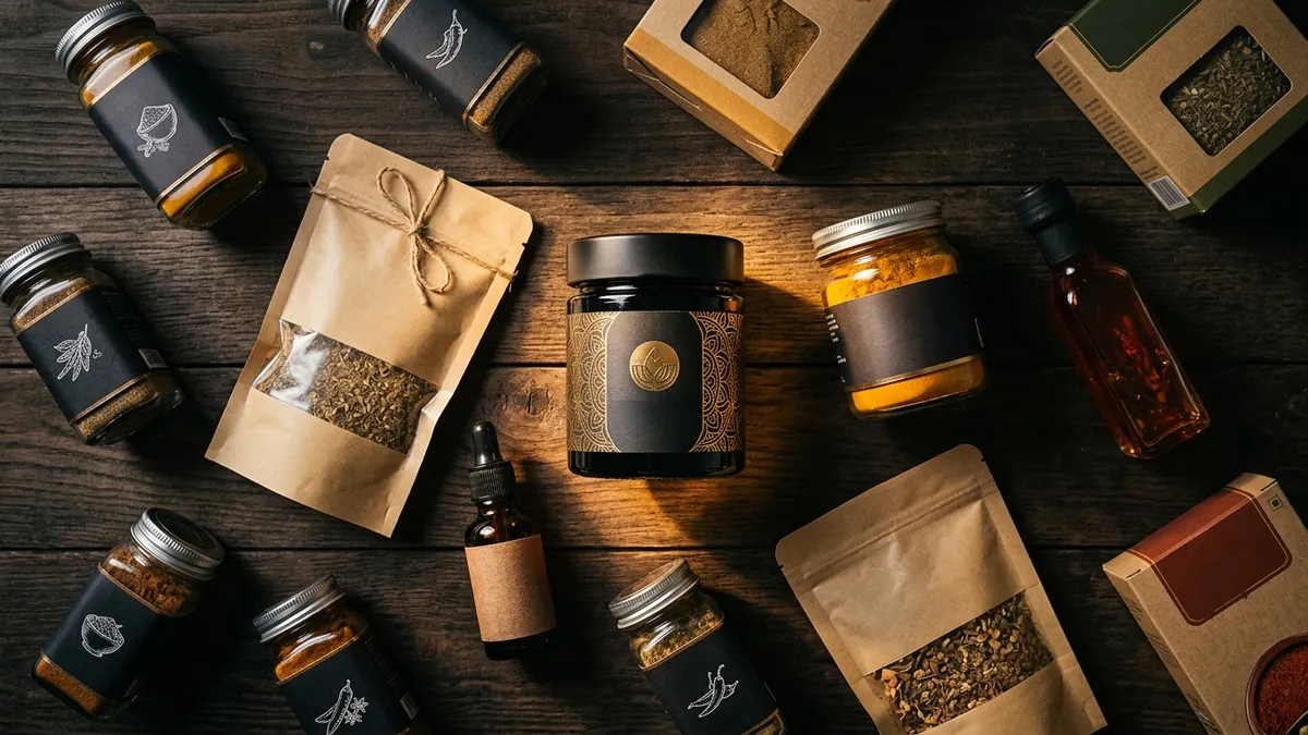
Then there is the material and finish question. Many MSME founders resist investing in better packaging material because it raises their cost per unit. I understand the constraint. But I have seen cases where switching from a plain matte pouch to a kraft paper bag with a simple stamp label — actually a cheaper intervention — elevated the perceived value of the product dramatically. The principle is not to spend more. The principle is to make intentional choices. A thoughtfully designed simple label on quality material beats an over-designed label on flimsy packaging every time.
If you sell on Swiggy Instamart, Blinkit, Amazon, or Flipkart, you have an additional challenge. Your packaging needs to work as a thumbnail. At 200 by 200 pixels, most Indian product packaging becomes completely illegible. The brand name disappears. The colours merge into a blur. The only thing that survives is a vague shape. If you want to grow on quick commerce or e-commerce, your packaging must be designed with the thumbnail test in mind — bold brand name, high contrast, minimal clutter. I run specific sessions on this during business growth workshops for product founders entering modern trade and online marketplaces.
The good news is you do not need to redo everything at once. Start with one SKU — your best-selling product or the one you want to push this quarter. Fix the hierarchy, fix the font, fix the colour, and test it. Talk to your distributors and retail partners. Ask them honestly: does this look like something a customer would pick up without being told to? Their answer will tell you more than any design award. Your product deserves to be seen. Make sure your packaging earns that chance.
Want to understand where your business growth is stuck?
Book a Business Growth Diagnostic with Abhijit JK — an honest, focused 60-minute one-to-one session with Abhijit JK on your brand, website and growth.
Book a Business Growth Diagnostic