Why Your Logo Looks Fine but Feels Cheap
Most business owners I meet have a logo. Some spent ten thousand rupees on it. Some got it done for five hundred on a freelance platform. A few had a nephew design it. But when I ask them — does your logo make customers feel something? — there is a long pause. That pause tells me everything.
Here is the honest truth. A logo can look perfectly fine on paper and still feel wrong when someone encounters it. It passes a basic visual check. It has a symbol, a name, maybe a tagline. But something is off. Customers cannot articulate it. They just move on. Prospects do not feel confident enough to enquire. Partners hesitate before referring you. That hesitation is costing you business every single week.
The most common reason a logo feels cheap is not the software it was made in or even the money spent. It is that the logo was designed in isolation — without any thinking about what the business actually stands for, who it is speaking to and what emotion it should trigger. I have seen this with manufacturers in Peenya who have brilliant products but a logo that looks like it belongs to a 1998 government pamphlet. The product is premium. The logo says otherwise. That mismatch breaks trust before a single conversation happens.
One specific problem I see repeatedly is the use of generic symbols. A consulting firm with a globe icon. A logistics company with an arrow. A food brand with a fork and spoon. These symbols have been used ten lakh times before you. They carry no meaning because they carry every meaning. When a logo uses a generic symbol, it tells the viewer that the business owner did not think hard about what makes them different. That is a poor first signal. If you want to understand how foundational these identity decisions are, start by reading about Abhijit and the kind of brand thinking that goes into real business identity work.
The second problem is proportion and spacing — things most founders never think about but eyes notice instantly. When a logo has a symbol that is too large next to a font that is too small, or when the spacing between letters is cramped or too loose, it creates a subconscious discomfort. We are trained by years of exposure to well-designed global brands. Our eyes know what balanced looks like, even if we cannot explain it. When your logo is off-balance, the brain registers it as careless. Careless logo, careless business. That is the unfair but real conclusion a customer draws in less than three seconds.
The third issue — and this one is particularly painful for growing businesses — is that the logo only works in one situation. It was designed for a visiting card and nothing else. When you put it on a banner, it pixelates. When you put it on a dark background, it disappears. When it is reduced to a WhatsApp display picture, nothing is readable. A professional logo should work across formats, sizes and backgrounds. Most cheap logos fail this test completely. If your business is at a stage where these decisions feel overwhelming, a one-to-one consultation can help you prioritise exactly what needs fixing first without rebuilding everything from scratch.
Colour also plays a large role in the feeling a logo creates. Many Indian business logos use gradients and multiple colours because it feels more decorative. But decoration and communication are different things. A logo that uses four colours with a gradient usually signals that the designer was trying to compensate for a weak concept. Strong logos work in one or two colours. They hold meaning in black and white. If your logo loses all its personality when you remove the colours, the concept underneath it is probably weak. This is related to a broader problem of how colour choices affect trust — something worth examining across your entire brand, not just your logo.
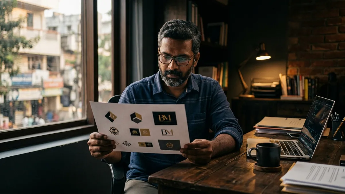
What can you actually do this month? Start by printing your logo on a white page at three sizes — large, medium and thumbnail. Then print it on a black background. Then look at it in pure grey. Ask yourself honestly: does the form still hold? Does it communicate something specific about your business, or could this logo belong to any business in your category? Show it to three customers who know you and ask them what feeling it gives them. Their answers will tell you more than any designer's opinion. Then compare it to three competitors you genuinely respect. Not to copy, but to understand the visual language of credibility in your market.
A logo is not just a piece of decoration. It is a compressed signal of everything your business represents. When it feels cheap, customers assume the product, service and experience will also be cheap. Fixing your logo does not require a full rebrand or a massive budget. It requires the right thinking first — clarity on positioning, audience and character — and then execution that reflects that thinking. If your team is unsure where to start with this kind of identity work, the business growth workshops I run have helped several MSME founders get this clarity in a structured way before spending a single rupee on design.
Want to understand where your business growth is stuck?
Book a Business Growth Diagnostic with Abhijit JK — an honest, focused 60-minute one-to-one session with Abhijit JK on your brand, website and growth.
Book a Business Growth Diagnostic