Why Your Product Packaging Looks Cheap on Camera
Most business owners I meet are proud of their packaging — and rightly so. They spent time choosing the box, finalized the label, approved the colours. It looks decent in the office. But the moment someone photographs it for Instagram or a buyer checks it on Amazon, something feels off. It looks flat. Cheap. Like a placeholder. Sales slow down and no one can explain why. The packaging is not the problem. The gap between how it looks physically and how it looks digitally — that is the problem.
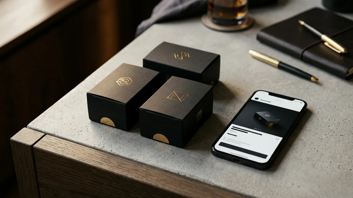
Here is what is really happening. Physical packaging works with light, texture and depth. When you hold a matte black box with gold foil lettering, your eyes see dimension and your fingers feel premium. A phone camera compresses all of that into a flat rectangle. The matte finish becomes a dull grey. The gold foil either washes out or looks yellow. The contrast that looked sharp in person now looks muddy on screen. Most packaging in India is designed for the shelf — not for the camera. In a world where your buyer is seeing your product first on a phone screen, that is a serious design problem.
I have seen this consistently with food brands, skincare founders, hardware product manufacturers and gifting businesses across Bengaluru, Pune and smaller tier-two towns. They invest in good print quality. But they never design with the digital medium in mind. The font that works at label size becomes unreadable as a thumbnail. The busy pattern that looks decorative on the box becomes visual noise in a product photo. And the colour that matched their brand offline looks completely different on screen because of how different screens render colour profiles.
There are a few specific things that kill packaging on camera. First is low contrast between text and background. If your product name is printed in dark brown on a chocolate-brown background, it may look elegant physically. But digitally, the text disappears. Buyers cannot read it. Their eye skips to the next product. Second is too much information on the front panel. Founders want to say everything — ingredients, certifications, variants, tagline, social handles. What this creates is visual clutter that a camera cannot do justice to. The front panel of your packaging has one job on camera: make the buyer stop scrolling. One clear product name. One strong visual. That is it. Third is an unclear colour story. When your primary colour, secondary colour and accent colour are not well defined and consistently applied across box, label, seal and insert card, the product looks assembled rather than designed. Buyers notice this even if they cannot articulate it.
The fix is not always a full redesign. Sometimes it is targeted. Start by photographing your current packaging under three conditions: natural window light, a plain white background, and as a flat lay on a dark surface. Look at these photos without zooming in — the way a buyer sees your product thumbnail on a marketplace or in a chat. Ask yourself: can I read the brand name instantly? Does the colour look intentional? Does this look like a product I would pay a premium for? If the answer to any of these is uncertain, you have found your problem areas. This is the kind of honest audit I walk founders through in a one-to-one consultation before we touch anything in the actual design.
Once you know what is breaking on camera, you can make specific changes. Increase contrast on your main text. Simplify the front panel to three elements maximum — brand name, product name and a single visual anchor. Define your colour palette clearly: one dominant colour, one supporting colour, one accent. And test every change photographically before you reprint. This sounds obvious but almost no one does it. They approve packaging in a PDF on a desktop screen under ideal conditions. Then the actual product goes into the market and gets photographed under tube lights with a phone, and it looks nothing like the approved design.
Typography is often the quietest culprit here. Many packaging labels in India use two or three different fonts — one for the brand name, one for the product description, one for the fine print — and none of them are related. It creates visual tension. On camera, this reads as inconsistent and low budget even if the font choices are individually decent. Choose one primary typeface and one secondary. Keep weights consistent. Make sure your brand name uses a font that stays legible at small sizes. If you are not sure where to start with this, the business growth workshops I run cover visual identity basics including typography decisions for product founders.
One more thing that rarely gets discussed: the background colour of your packaging affects how it looks in every context. Light backgrounds photograph well in bright light but look washed out outdoors or in dark settings. Dark backgrounds look premium in controlled studio photos but become muddy in WhatsApp forwards and quick phone snaps. The safest approach for founders who cannot afford a full photography studio setup is to choose a packaging background that has enough contrast built into the design — so even an imperfect photo taken by a retailer or a customer still reads well. Your packaging needs to market your product even when no professional photographer is involved.
Packaging design is not just about aesthetics. It is a sales tool. In India, where a huge portion of buying decisions now happen through discovery on a phone — Instagram reels, WhatsApp catalogue shares, Amazon thumbnails, Meesho listings — your packaging is doing the job a salesperson used to do. It either earns trust in two seconds or it gets scrolled past. If you want your product to hold its own in that environment, design it for the camera first and the shelf second. If you are ready to rethink how your packaging shows up across digital and physical touchpoints, reach out and let us talk through it.
Want to understand where your business growth is stuck?
Book a Business Growth Diagnostic with Abhijit JK — an honest, focused 60-minute one-to-one session with Abhijit JK on your brand, website and growth.
Book a Business Growth Diagnostic