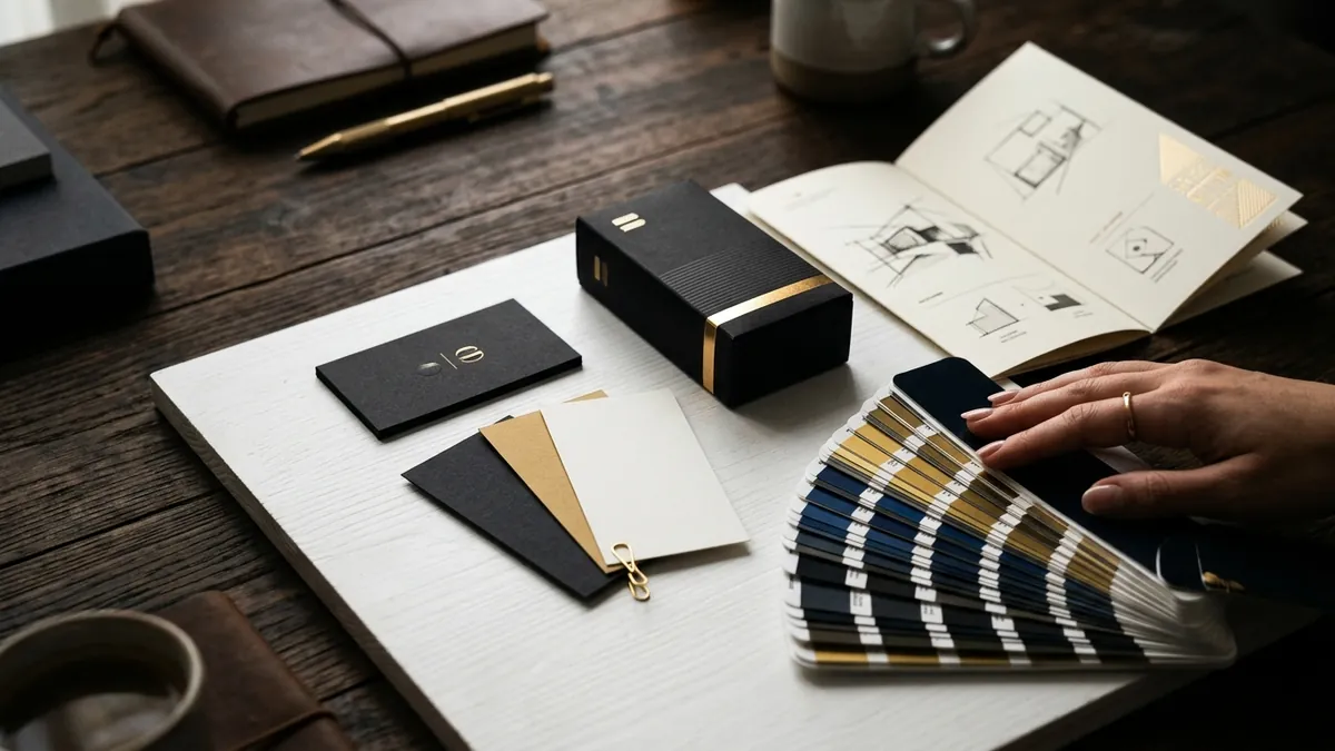
Why Your Packaging Design Looks Cheap on Camera
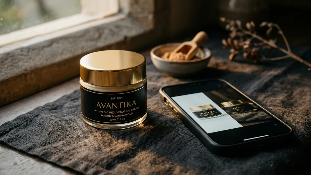
Most product founders I meet have spent real money on packaging. A decent box. A label printed on good stock. Sometimes even a logo designed by a proper studio. But then they photograph the product, put it on their website or Instagram, and something feels wrong. The product looks ordinary. Sometimes it looks cheap. And nobody can point to exactly why.
Here is what is actually happening. Packaging is designed for hands — for the moment someone picks it up at a shelf or opens a box. But today, the first impression of your product happens on a phone screen, not in the hand. Those are two completely different experiences. A label that reads beautifully at arm's length can become a blur of colour and text on a 5-inch screen. A matte black box that feels premium to touch can look flat and dull in a photograph with no texture.
I have seen this with food brands, skincare founders, gift product businesses, even industrial equipment manufacturers who are now selling on IndiaMart. The packaging was not wrong — it was just designed for one context and being used in another. Nobody noticed the gap until buyers started scrolling past without stopping.
The first thing to check is text density on your label. Most Indian product labels try to say too much. Manufacturing date, weight, ingredients, certifications, tagline, brand story — all on one surface. In person, you can hold it and read slowly. On a screen, a buyer sees everything and reads nothing. The packaging ends up looking cluttered, which reads as cheap. The rule I use with my clients: whatever text your label has today, cut it by half. Let one thing lead — the brand name or the product name. Everything else is secondary.
The second issue is colour rendering. Printed colours behave differently under different lighting. A warm yellow that looked rich on your Pantone proof will wash out under cool white photography lights. A deep green will shift to olive. If your packaging was designed with print as the final destination, you need to revisit your colours specifically for screen. This does not always mean reprinting everything — sometimes adjusting how you photograph and light the product solves 70 percent of the problem. If you are confused about why your brand colours behave differently across contexts, I have written about this in detail separately.
Third, think about what is visible in a thumbnail. On an ecommerce listing, a social media grid, or a WhatsApp catalogue, your product appears at roughly the size of a matchbox. At that size, only two or three elements are recognisable — typically your dominant colour, your logo mark if it is bold enough, and your product shape. If none of these three create a clear, distinct impression at small size, your packaging is invisible in a feed. Most founders have never tested this. Take a screenshot of your product photo, shrink it to thumbnail size on your phone and look at it honestly. That is what your buyer sees first.
There is also the problem of background and surface. Packaging does not exist alone — it sits on a surface, in a setting, against some background. Many Indian product sellers photograph on a plain white surface under tubelight. The result is a clinical, lifeless image that makes even good packaging look like a commodity. The surface, the light quality, the props around the product — all of these are part of your visual identity. A handmade soap brand shot on a linen cloth near a window looks entirely different from the same soap photographed on a plastic table under fluorescent light. Same product. Same packaging. Different buyer perception completely. This is a conversation I regularly have during one-to-one consultation with product founders — because no one teaches this in packaging school.
If you are building a product brand for the Indian market right now, you are selling in at least three places simultaneously — your own website, a marketplace, and Instagram or WhatsApp. Each of these has different image dimensions, different thumbnail sizes, different lighting norms. Your packaging identity needs to hold across all three. This is what I mean when I say design consistency is not just about your logo — it is about how your entire product shows up in every sales context. Founders who crack this early scale faster because buyers recognise and trust them across touchpoints. If you want a structured way to think through this for your brand, the business growth workshops I run include a visual identity session built specifically for product founders.
Start with one practical step this month. Photograph your existing product packaging in three ways — on a plain white background, on a textured natural surface, and as a flat lay from above. Then shrink all three to thumbnail size and compare. You will immediately see which version reads as premium and which one disappears. That single test will tell you more about what needs fixing than any packaging agency brief. Sometimes the packaging itself is fine — it is just never been shown correctly. And sometimes that test will confirm what you already suspected: the design itself needs rethinking. Either way, now you will know for sure.
Want to understand where your business growth is stuck?
Book a Business Growth Diagnostic with Abhijit JK — an honest, focused 60-minute one-to-one session with Abhijit JK on your brand, website and growth.
Book a Business Growth Diagnostic