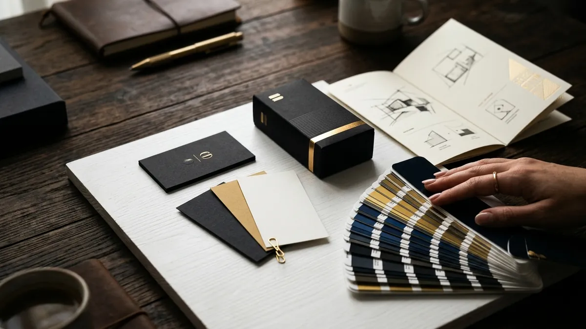
Why Your Visual Identity Looks Different Everywhere
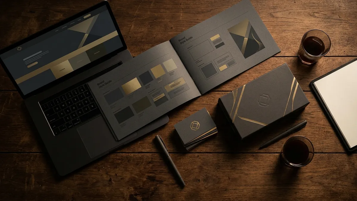
Most business owners I meet have a logo. Some even have a decent one. But when I look at their Instagram page, their visiting card, their product catalogue and their website — four completely different colour shades, two or three font combinations, and a logo that has been stretched, recoloured or replaced with a newer version somewhere along the way. To the owner, it all feels familiar. To a new customer seeing it for the first time, it feels like four different companies.
This is the most common and most underestimated branding problem I see with Indian MSMEs, manufacturers and service businesses. It is not that their design is ugly. It is that it is inconsistent. And inconsistency reads as unprofessional, even when the product or service itself is excellent. A buyer browsing your catalogue after checking your Instagram will notice — not consciously, but they will feel it. Something feels off. They cannot explain why. But they hesitate.
Here is what actually happens in most growing businesses. The owner gets a logo made in 2018. Then a cousin's friend redesigns the website in 2021 and picks slightly different colours because the original hex codes were never saved. The packaging gets done by a local printer who uses whatever font looks good to him. The Instagram posts are made on Canva by a team member using the default brand kit, which was never properly set up. By 2024, the business has a patchwork identity that nobody planned for. I have seen this with manufacturers in Pune, retail chains in Bengaluru and service businesses across tier-2 cities.
The fix is not an expensive rebrand. It starts with something simple — a one-page brand reference document. Write down your exact logo file names and approved versions. Note your precise colour codes in HEX, RGB and CMYK. List the two or three fonts your brand uses and where each one is used — headlines, body text, captions. Then share this with anyone who creates anything for your business. Printer, social media team, web developer, packaging vendor — everyone gets the same document. This one step eliminates 80 percent of the inconsistency problem. If you are not sure how to build this out for your business, a one-to-one consultation can help you create a clean, usable brand reference in a single focused session.
Now, the logo file issue deserves its own conversation. Most business owners have their logo saved as a WhatsApp-compressed JPEG that someone forwarded them three years ago. That file is useless for printing. You need your logo in vector format — typically an AI, EPS or SVG file — so it can scale to any size without distortion. If you do not have this file, contact whoever designed your logo and ask for it. If they no longer have it, a designer can recreate it. This is not optional. Every time your logo is printed blurry or pixelated on a banner or a box, it is telling your customer something about your attention to detail.
Typography is the silent problem most founders ignore. I have sat with business owners who have five different fonts running across their materials — and none of them were chosen intentionally. A bold condensed font on the brochure, a serif on the letterhead, a handwritten style on Instagram, and whatever Microsoft Word defaulted to on the quotation. Pick two fonts maximum. One for headings, one for body text. They should feel related — not identical, but from the same visual family. Consistent typography alone makes a business look significantly more put-together than most of its competitors, especially in categories where everyone else is equally inconsistent.
Colour discipline matters more than most people realise. I worked with a food brand in Karnataka where the red on their packaging was a warm brick red, but the red on their Instagram posts and standees was a bright cherry red. Same brand, two completely different moods. The owner had never noticed it until a retailer mentioned that the product on the shelf looked different from the promotional material. That kind of mismatch creates confusion at the exact moment a customer is deciding whether to pick up your product or move on. Nail down your palette — primary colour, secondary colour, one neutral — and protect it across every single touchpoint.
If you have a team creating content and collaterals, templates are the fastest way to enforce consistency without constant supervision. Build a set of Canva or PowerPoint templates — one for social posts, one for stories, one for presentations, one for quotes and proposals — using your correct colours, fonts and logo placement. Lock the brand elements so they cannot be accidentally changed. This removes the guesswork from your team and means your brand looks the same whether your marketing person is in office or working from home. At our business growth workshops, this is one of the first practical systems we help founders put in place, because the impact is immediate and visible.
Design consistency is not about being rigid or boring. It is about being recognisable. The goal is that when someone sees your content on Instagram, then receives a quotation from you by email, then picks up your brochure at an exhibition — they feel they are dealing with the same, confident, organised business throughout. That feeling of coherence is what builds trust before a single conversation happens. Get your brand reference document in place this month, track down your vector logo file, and audit every platform your brand appears on. The gaps will be obvious once you start looking. And closing those gaps is one of the highest-ROI things you can do for your business right now.
Want to understand where your business growth is stuck?
Book a Business Growth Diagnostic with Abhijit JK — an honest, focused 60-minute one-to-one session with Abhijit JK on your brand, website and growth.
Book a Business Growth Diagnostic