Why Your Visual Identity Looks Different on Every Platform
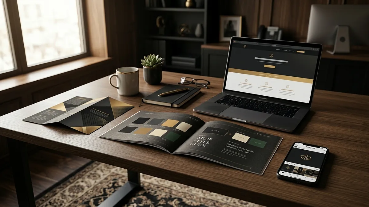
Most business owners I meet have the same problem. They spent good money on a logo. They have a website. They are active on Instagram. But if you open all three side by side, they look like three different businesses. Different shades of the same colour. Different fonts. The logo is stretched on the brochure, cropped on WhatsApp and completely missing from email. This is not a small design detail. It is a trust problem.
Here is what actually happens in the buyer's mind. When someone sees your Instagram post and then visits your website and then receives your quotation PDF, their brain is quietly doing a check. Does this all feel like the same company? If the answer is no — even for a split second — you lose a little credibility each time. They may not say it out loud. They just feel less confident handing you their money. I have seen this pattern with manufacturers in Bengaluru who have excellent products but look like a different business on every touchpoint.
The root cause is almost always the same. There was no brand style guide created when the logo was designed. The designer delivered a logo file, maybe a visiting card design and that was it. Over the next two years, different people in the business — the owner, an intern, a vendor who prints banners — all made their own decisions about what colours to use, what fonts looked nice and how big to place the logo. Nobody had a reference document. So every piece of communication slowly drifted apart.
A brand style guide does not have to be a 40-page PDF. For most Indian MSMEs, a simple two-page document solves 80 percent of the problem. It should define three things clearly. First, the exact logo versions — the primary logo, the icon version and what minimum size it should be. Second, the exact colour codes — not 'blue and white' but the HEX code for digital, the CMYK value for print and the Pantone reference if you do high-end packaging. Third, the fonts — which typeface for headings, which for body text and where not to use decorative fonts. If your team has this, most inconsistency stops immediately.
One mistake I see constantly is founders using free Canva templates without locking their brand colours first. Canva is a useful tool. But if every person in your team is picking colours from the Canva palette by eye, you will end up with five slightly different shades of your brand colour across different posts. Some look warm, some look cool, some look faded. To a regular viewer it feels like something is off, even if they cannot explain why. The fix is simple — add your exact HEX codes to your Canva brand kit and lock them. Takes fifteen minutes once, saves years of drift.
Typography is the other place where things fall apart quietly. A business might have started with one font in their logo, then someone used a different font for the website because it was the default theme font, then the sales team used Arial in their Word documents because that was system default. Now you have three different font personalities speaking on behalf of your brand. If you want practical help mapping out these touchpoints for your own business, a one-to-one consultation can help you identify exactly where the gaps are and what to fix first.
For product businesses — especially those in retail or D2C — packaging and label design is the most visible place this breaks down. I have worked with food brands where the packaging looks premium, but the Instagram post promoting it uses a completely different colour scheme and a generic font downloaded from the internet. The customer sees the beautiful pack on the shelf, looks up the brand on Instagram and feels confused. That confusion costs you followers, and more importantly, it costs you repeat purchases. If you are in this space, you already know what I mean by the time you read this.
The fix is not expensive. It requires one committed afternoon with whoever handles your design and marketing. Pull every single touchpoint together — your logo file, your website, your social media templates, your letterhead, your packaging, your presentation deck. Look at them all at the same time. Where do they feel disconnected? Make a list. Prioritise the ones your customers see most often. Fix those first. If you want a more structured approach to this, I run business growth workshops where we walk through brand consistency and positioning together with small groups of founders. Many of them have done exactly this exercise live in the room and left with a clear action plan.
Consistency is not about being boring or never evolving your brand. It is about making sure that everywhere your customer encounters you, they feel the same thing. The same level of care, the same quality signal, the same personality. That repetition is what builds trust over time. And trust, in the Indian MSME context where word-of-mouth still drives most business, is worth more than any individual ad campaign you will ever run. Fix your visual identity once, properly, and it works for you silently every single day.
Want to understand where your business growth is stuck?
Book a Business Growth Diagnostic with Abhijit JK — an honest, focused 60-minute one-to-one session with Abhijit JK on your brand, website and growth.
Book a Business Growth Diagnostic