Why Your Visual Identity Looks Different on Every Platform
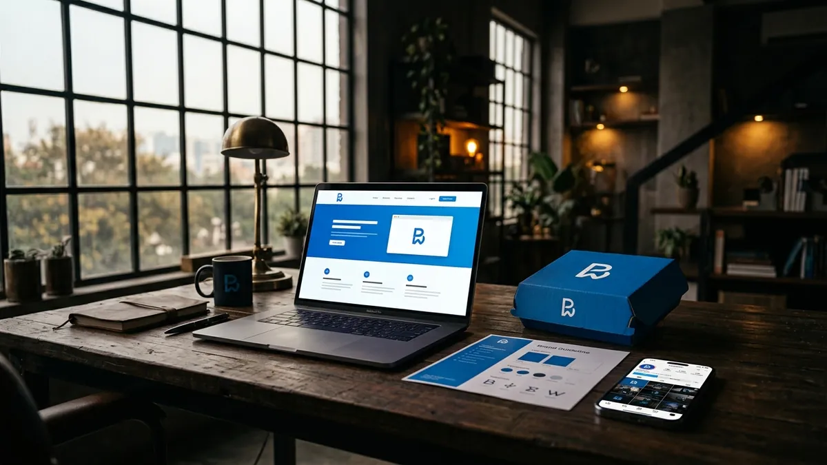
Most business owners I meet have spent real money on a logo. Sometimes a good amount. But ask them to open their website, their Instagram profile, their WhatsApp Business page and their visiting card side by side — and you will see four completely different versions of the same brand. Different shades of the logo colour. Different fonts on every banner. The logo stretched on the letterhead. A cropped version on the social profile that nobody approved. This is one of the most common and most damaging design problems I see with Indian MSMEs, manufacturers and service businesses.
The problem is not that the logo is bad. The problem is that nobody ever defined how the logo should be used. No rules were written down. The designer who made the original file handed it over and moved on. Then the owner sent it to a printer, a social media vendor, a web developer and a packaging supplier — all separately. Each person used the file they had and made their own judgements about size, colour, spacing and placement. Six months later, the brand looks like it has six different owners.
Buyers process visual information very fast. Before they read a single word on your website or brochure, they have already formed an opinion about whether you look trustworthy or not. When your brand keeps shifting its face — different shades of blue here, a different font there, the logo squeezed into a square it was never meant to fit — something feels slightly off. Buyers cannot always explain it. But they feel it. And that feeling translates into hesitation. Hesitation kills enquiries.
I have seen this with manufacturers who sell B2B. They have a decent product and a reasonable price. But their catalogue uses one version of the brand, their email signature uses another, and their trade fair standee looks like it belongs to a completely different company. The buyer they are pitching to has already visited five stalls that day. Inconsistency signals disorganisation. And nobody wants to place a large order with a company that looks disorganised. This is not about being fancy. It is about being coherent.
The fix starts with one document — a basic brand guideline. It does not need to be a 60-page PDF. Even a two-page reference sheet works. It should clearly mention: the exact logo files to use (with their correct file formats for print and digital separately), the official brand colours with their HEX codes for screen and CMYK values for print, the fonts used for headings and body text, and a few examples of what not to do. That last part matters more than most founders think. Showing a stretched logo, a wrong colour approximation or an unapproved font with a clear 'do not use' label prevents 80 percent of the downstream damage.
Once you have that document, share it with everyone who touches your brand. Your social media team. Your printer. Your packaging vendor. Your website developer. Your internal person who makes WhatsApp forward graphics. Make it a rule that nobody creates any brand material without referring to this document. This sounds obvious but almost nobody does it. Most small businesses run entirely on WhatsApp approvals and memory. Memory is not a brand system. If you want help thinking through what a brand guideline should cover for your specific business type, a one-to-one consultation is often the fastest way to get this sorted without overcomplicating it.
There is also a practical file management issue that makes this worse. Many business owners have their logo in three different places — the original file sent by the designer (often in an unusable format), a JPEG someone exported, and a PNG that the social media vendor saved from the website. None of these are the master file. When a new vendor asks for the logo, whoever responds just sends whatever they can find quickly. The result is unpredictable. The fix is to create one shared folder — Google Drive works perfectly — with clearly labelled logo files in every format you will ever need. Colour version, white version, black version. PNG for digital, vector file for print. Label them clearly. Make this folder accessible to everyone who works on your brand.
Colour drift is another silent problem. Your brand might officially use a navy blue. But your printer approximates it as a dark blue-grey because nobody gave them the CMYK value. Your Instagram vendor uses a slightly brighter blue because they picked the colour from a JPEG by eye. Now your packaging, your Instagram and your brochure all show slightly different blues. Individually, each looks fine. Together, they make your brand feel unstable. I run a session specifically on this at business growth workshops because it is one of those details that founders dismiss until they see the before-and-after side by side — and then they cannot unsee it.
Visual identity consistency is not a luxury for large companies with design teams. It is a basic business habit. It tells buyers that you are systematic. It tells them that you take your work seriously. And it removes one more invisible reason for them to hesitate before calling you. You do not need to redesign your logo. You do not need a new brand. You need to decide what your brand already is — and then make sure every platform, every vendor and every piece of material reflects exactly that. Start this month. Pull up your website and your Instagram side by side. If they do not look like they belong to the same company, you have your first action item right there.
Want to understand where your business growth is stuck?
Book a Business Growth Diagnostic with Abhijit JK — an honest, focused 60-minute one-to-one session with Abhijit JK on your brand, website and growth.
Book a Business Growth Diagnostic