Why Your Typography Is Quietly Killing Your Brand Trust
Most business owners I meet have spent real money on a logo, a website, maybe even a brochure. But when I ask them why they picked the fonts they use, I get a blank stare. The usual answer is: 'The designer chose it' or 'It looked good at the time.' That is where the problem starts. Typography is not decoration. It is one of the loudest signals your brand sends before a buyer reads a single word.
Here is what actually happens when a buyer lands on your website or picks up your brochure. Their brain processes the visual feel of the page before it reads the content. Heavy, cluttered fonts make a business look cheap or outdated. Thin, illegible fonts make it look careless. Mismatched fonts — say, a bold decorative heading with a completely unrelated body text — make it look like nobody is in charge of the brand. All of this happens in under three seconds. The buyer has already formed an opinion before they have read your product name.
I have seen this with manufacturers in Bengaluru and Pune who make genuinely high-quality products. Their production is tight, their materials are good, their pricing is fair. But their quotation document uses five different fonts, their website heading is in a bold serif that clashes with the rest of the page, and their business card uses a font that came free with Microsoft Word. A buyer comparing two vendors — one with consistent, clean typography and one with this kind of visual noise — will almost always trust the first one more, even if the second one is the better manufacturer.
The core issue is that most Indian MSMEs treat typography as an afterthought. Fonts are picked based on what looks 'fancy' or what the designer defaulted to. There is no thought given to what the font communicates. A thin geometric sans-serif says modern and minimal. A rounded sans-serif says friendly and approachable. A sharp serif says established and serious. A handwritten script says personal and artisanal. When your font does not match what your business actually does or who you sell to, there is a disconnect — and buyers feel it even if they cannot name it.
Another mistake I see constantly is using too many fonts. When founders or their team members start creating content — social media posts, presentations, invoices, packaging labels — they each pick fonts they like. Slowly your brand ends up with six different typefaces across six different touchpoints. Nothing looks connected. Nothing looks intentional. And a brand that does not look intentional does not look trustworthy. If you have been working on your visual identity for a while and something still feels off, this is usually the reason.
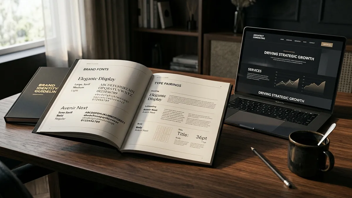
The fix is simpler than most founders expect. You need two fonts. One for headings, one for body text. That is it. Pick a heading font that reflects your brand personality. Pick a body font that is clean and readable at small sizes — a neutral sans-serif almost always works. Lock them in. Document them. Share the font names and sizes with anyone who creates anything for your business. This one decision, made clearly and followed consistently, will make your brand look more professional within a week. If you want help working this out properly for your specific business, a one-to-one consultation is often the fastest way to get it done right.
There is also the question of size and spacing. Even the right font looks wrong when it is too small to read, too tightly packed, or randomly sized across a page. I have reviewed websites where the heading font is smaller than the body text. I have seen packaging where the product name is in a light-weight font that disappears on a coloured background. These are not minor issues. They directly affect how much effort a buyer has to put in to understand your offering — and most buyers will not put in any effort. They will just move on.
If you run a business that sells to other businesses — manufacturers, service providers, consultants — typography matters even more because you are being evaluated on professionalism. Your proposal, your letterhead, your email signature, your presentation deck — all of these are judged visually before they are read. A cluttered or inconsistent typographic system makes you look like a small player even if you are not. I have run business growth workshops where founders were genuinely surprised to see how much cleaner their materials looked after fixing just the font system — no redesign, no new logo, just consistent typography.
Start this month with a simple audit. Open five things your business sends out or publishes — your website, a proposal, a social media post, a brochure, an invoice. Count how many different fonts appear. Note whether the fonts feel like they belong to the same brand. Note whether the text is easy to read at a glance. If anything feels disconnected or effortful, that is your starting point. Typography will not fix everything, but getting it right quietly builds the kind of visual credibility that makes buyers take you seriously before you even open your mouth.
Want to understand where your business growth is stuck?
Book a Business Growth Diagnostic with Abhijit JK — an honest, focused 60-minute one-to-one session with Abhijit JK on your brand, website and growth.
Book a Business Growth Diagnostic