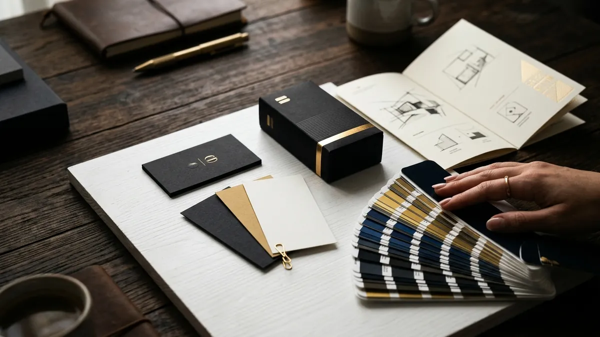
Why Your Product Packaging Loses Buyers at the Shelf
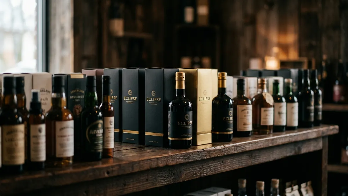
Most product founders I meet have spent months perfecting their formulation, their recipe or their manufacturing process. The packaging gets done in the last two weeks before launch. A cousin helps with the label. The printer suggests a template. The font is picked because it looked 'decent.' And then the product sits on a shelf or inside a courier box — and nothing moves. The product is not the problem. The packaging is.
Here is what actually happens at a retail shelf or on a product listing page. A buyer's eye moves across fifteen to thirty options in under five seconds. The brain is not reading. It is pattern-matching — colour, shape, contrast, familiarity, trust signals. If your packaging does not interrupt that scan, the buyer's hand reaches for something else. You never even got a chance to explain your product's quality, your ingredients, your story. The shelf decides before the buyer does.
The first mistake I see repeatedly is trying to say too much on the front panel. Founders are proud of what they have built, and understandably so. So they put the brand name, the product variant, five benefit claims, a certification badge, a QR code, a tagline and an 'as seen on' logo — all on a label the size of a playing card. The result is visual noise. The eye does not know where to go. When everything shouts, nothing is heard. A strong packaging front has one job: stop the buyer and hand them one clear reason to pick it up.
The second issue is colour that blends into the category instead of standing out from it. I worked with a small cold-pressed oil brand in Karnataka. Their packaging was earthy brown and dark green — because 'natural' products should look natural, they told me. The problem was that every competing brand on that shelf was also brown and green. They were invisible. When we shifted to a clean off-white background with a strong single-colour accent, they went from being ignored to being the brand people paused on. Colour strategy in packaging is not about what looks beautiful in isolation. It is about what creates contrast on your actual shelf or page.
Typography is where most small brands unknowingly communicate 'cheap.' A decorative script font that looked elegant on a laptop screen becomes unreadable at 30ml bottle size. A bold condensed font chosen for its 'strength' looks aggressive on a wellness product. The font on your packaging is not just carrying information — it is communicating the personality of the brand before the buyer reads a single word. If you want to understand how font choices shape brand perception at a deeper level, I have written about this in detail as part of how I approach visual identity work when I work with founders through one-to-one consultation.
The third structural problem is inconsistency across variants or SKUs. A brand launches one product with a particular packaging design. Then they add two more variants. Each gets done separately — sometimes by different designers, sometimes in a hurry. Now the brand's product range looks like three different companies on the same shelf. Buyers and retailers both notice this. Shelf presence is built by visual family — when your products stand together and look like they belong to one strong brand, you look like a real company. That coherence does not happen by accident. It requires a packaging design system, not just packaging design.
One thing most founders underestimate is the role of the unboxing moment — especially for D2C brands shipping through courier. The outside box, the inner wrap, the product packaging, the insert card — each of these is a touchpoint that either builds or breaks trust. I have seen premium-priced products arrive in a plain brown box with a photocopied invoice stuffed inside. The buyer paid fifteen hundred rupees and felt like they ordered from a wholesale distributor. Conversely, I have seen founders with modest budgets create a genuinely memorable unboxing experience simply by being intentional: a tissue wrap in brand colour, a small thank-you card with a handwritten-style note, a clean insert explaining how to use the product. None of it cost a fortune. All of it communicated care.
If you are a product-based business wondering whether your packaging is working against you, here are three things to do this month. First, take your product and place it next to three competing products on a flat surface, photograph it and look at the photo on your phone. Does your brand stand out or disappear? Second, cover your brand name on the label and show the packaging to five people who do not know your product. Ask them what kind of brand this feels like — premium, affordable, trustworthy, cheap? Their answers will tell you what your design is communicating. Third, check if all your SKUs or product variants look like they belong to the same family when placed together. If they do not, that is a design system problem worth fixing before you scale. If you want structured help working through this, I run business growth workshops where packaging and brand identity form a core part of how we diagnose what is holding a product brand back.
Good packaging design is not about spending more money. It is about making deliberate decisions — about colour, hierarchy, typography, finish and the story your shelf presence tells in three seconds. Most Indian product brands are losing buyers not because their product is weak, but because the packaging never gave the product a fair chance. Fix that first, and everything else — your retail conversations, your online listings, your repeat purchases — gets easier. If you want to talk through your specific packaging challenge before investing in a redesign, feel free to reach out through the contact page and we can have a direct conversation about what actually needs to change.
Want to understand where your business growth is stuck?
Book a Business Growth Diagnostic with Abhijit JK — an honest, focused 60-minute one-to-one session with Abhijit JK on your brand, website and growth.
Book a Business Growth Diagnostic