Why Your Brand Has No Visual Consistency Across Touchpoints
Most business owners I meet have spent decent money on design at some point. A logo from a designer, a website from an agency, a packaging job from a local printer, social media creatives from a freelancer who charges by the post. Each piece looks okay on its own. But put them all together — business card, Instagram page, product box, storefront banner — and they look like four different companies. That is a visual consistency problem. And it is costing you more than you think.
Here is what actually happens in a buyer's mind. They see your Instagram page, it looks modern and clean. They visit your website, it looks like it was built in 2014. They receive your product and the packaging uses completely different fonts and colours. Their brain registers the mismatch even if they cannot name it. The feeling they walk away with is this: something is off. That feeling is enough to stop a repeat purchase or a referral. Buyers do not trust brands that look confused about themselves.
I have seen this with manufacturers in Bengaluru and Pune who supply to modern trade or export markets. They build decent products. But their trade catalogues use one font, their invoice header uses another, their product labels use a third, and their WhatsApp status creatives look like Diwali sale posters. A retail buyer sitting in a procurement meeting looks at all of this and mentally marks the vendor down as unorganised. The product never even gets a fair shot.
The root cause is almost always the same. There is no brand style guide. Not even a simple one. Nobody inside the business knows which exact shades of the brand colour to use, which fonts are official, how much white space goes around the logo, what tone the copy should carry. So every designer, every printer, every social media intern makes their own call. And slowly, over months and years, the brand fractures visually. If you have been thinking about getting this sorted properly, a one-to-one consultation is often the fastest way to diagnose exactly where your brand identity is breaking down.
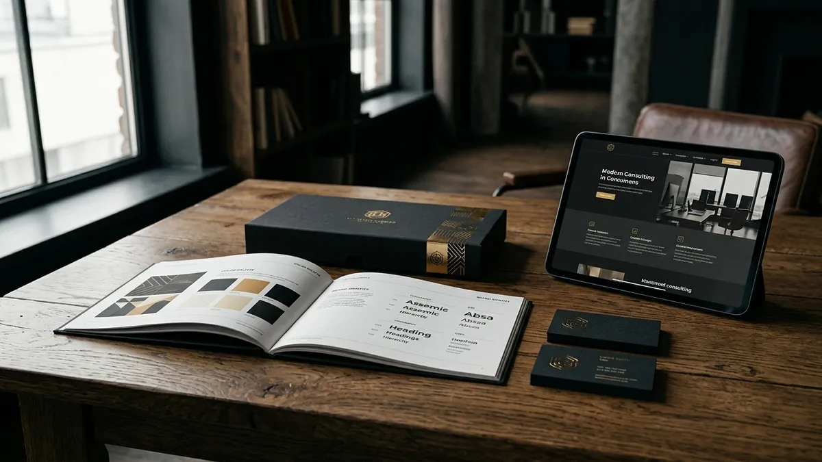
A brand style guide does not need to be a 60-page document. For most Indian MSMEs and small businesses, a four to six page PDF is enough. It should clearly define your primary and secondary colours with the exact HEX, RGB and CMYK codes. It should name the fonts you use for headings and body copy. It should show the logo in its approved versions — full colour, white, dark background — and the minimum size at which it can appear. It should have one or two example layouts showing correct usage. That one document, shared with every vendor, printer and designer you work with, saves you from years of brand drift.
Now here is something practical you can do this week. Open your phone and pull up your business card, your Instagram profile, your website on mobile, and a photo of your packaging or storefront. Screenshot all four. Put them side by side. Ask yourself honestly: do these look like they belong to the same brand? Do they use the same colours? The same style of typography? The same tone in the text? If the answer is no, you now have a clear list of what needs fixing. Prioritise the touchpoints your buyers see most often. Start there.
Retailers, distributors and modern trade buyers are particularly sensitive to this. I have sat with buyers from large retail chains who openly say they evaluate a vendor's professionalism by how consistently branded their materials are. Sloppy visual consistency signals sloppy operations. Clean, consistent visual identity signals a brand that has its house in order. This is why two products with similar quality sitting on the same shelf — one with tight brand consistency, one without — will always see the consistent brand win on shelf pickup. If you want to go deeper on this, I cover real brand-building frameworks in my business growth workshops for founder teams.
One more thing founders often get wrong: they fix the digital but ignore the physical. Or they upgrade the packaging but forget the email signature, the invoice template, the delivery box tape, the label on the sample pouch they send to prospects. Every single surface where your brand appears is a touchpoint. And a buyer who receives a beautifully packaged product inside a plain brown box with a handwritten chit has just experienced a brand inconsistency. These small things add up. They shape whether someone feels they bought from a serious brand or just a supplier.
Visual consistency is not about being fancy. It is about being recognisable and trustworthy wherever someone encounters you. A buyer who sees your ad on Instagram, visits your website, receives your product and reads your follow-up email should feel like they have been dealing with one coherent, confident brand throughout. That coherence builds familiarity. Familiarity builds trust. Trust drives repeat purchases and referrals. If you want to understand how to build this properly for your specific business, you can read more about my approach on the about Abhijit page or simply contact me directly.
Want to understand where your business growth is stuck?
Book a Business Growth Diagnostic with Abhijit JK — an honest, focused 60-minute one-to-one session with Abhijit JK on your brand, website and growth.
Book a Business Growth Diagnostic